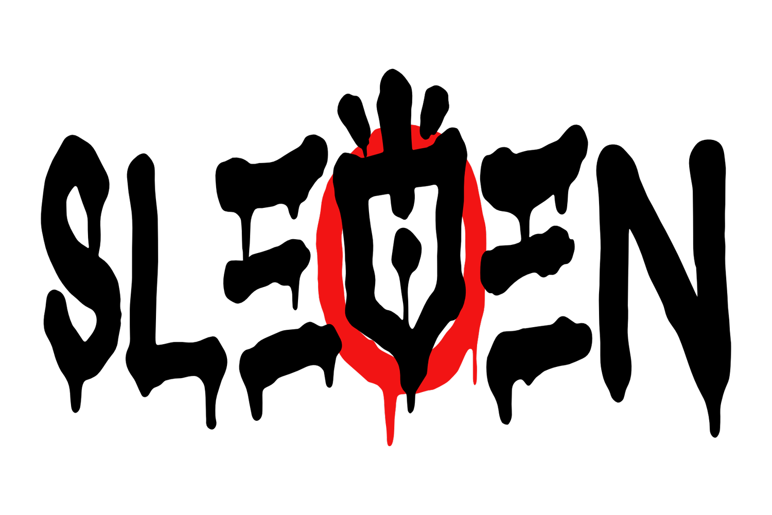
Art on Wax
Visual beats for audible treats. This section’s stacked with the sleeves I've alchemised for hip-hop releases over the years. With a couple of wayward sonic mutants in the mix. From front covers to full CD packages, each cover’s been brewed to match the rhythm and mood of the music it wraps. Expect lyrical chaos finessed into a parlour of illuminated details, with a touch of that formidable Sleven flair. If your ears had eyes, they'd want to live here.
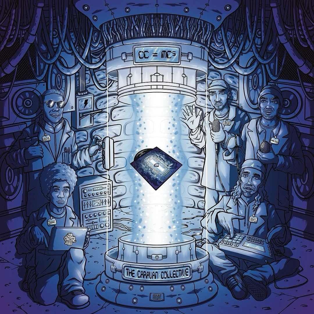
Front cover artwork for @thecaravancollective_uk album CC=MC5. Belter of an album, out on @reefuzzrecords. Sleven's worked on a few projects now with different members of The Caravan Collective, this being the first one worked on for them as a collective. They hit Sleven up with the idea of them in a science lab creating the album. After a few questions and spit balling with the CC, Sleven's mind led him to the idea of them creating a hip-hop monster MC, in a Frankensteins monster, hammer horror style scene. Through feed back from the CC boys, this turned from a monster MC back into the album being created through some mad science son! But still in the vein of the mad scientist Frankenstein, inna hammer horror styleee. Each MC was given an instrument that represents them most accurately in the creation process of the album and music they make in general. The CC wanted to keep the cover art consistent to their previous releases , through the colour palette of blues & purples. This colour way worked well with the image that had been set and also a good representation of the type of music it is. Blue representing how stone COLD sick the album is, with the lyrics and beats and the purple representing that undertone of magic & self awareness that also comes with that. It was an absolute pleasure working on this piece for the Caravan Collective.
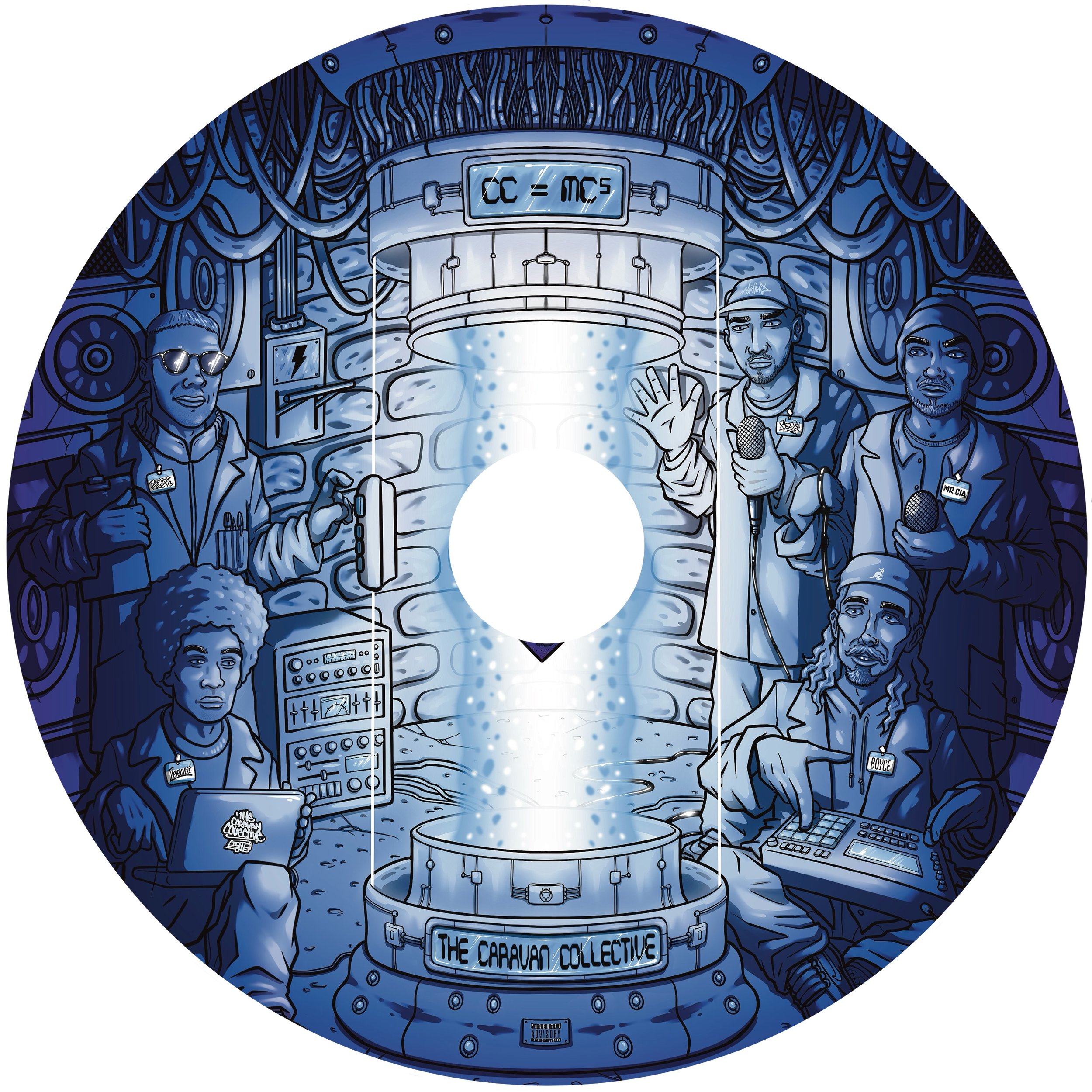
Artwork from the front cover was just used as the CD art. Unfortunately the Cd hole in the centre clipped out the record in the construction chamber beam but the rest of the image worked extremely well in a circular frame.
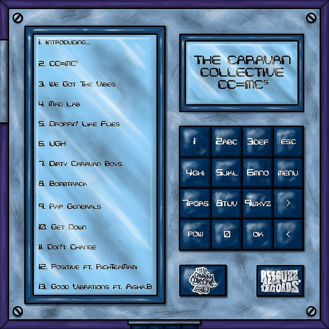
Back cover for CC=MC5 by the Caravan collective. The idea for the back came from what would be on the key pad panel that's being used on the side of the construction chamber, that the albums being created in? And the answer is this, it'd have the track list being uploaded into the creation chamber, obvs!
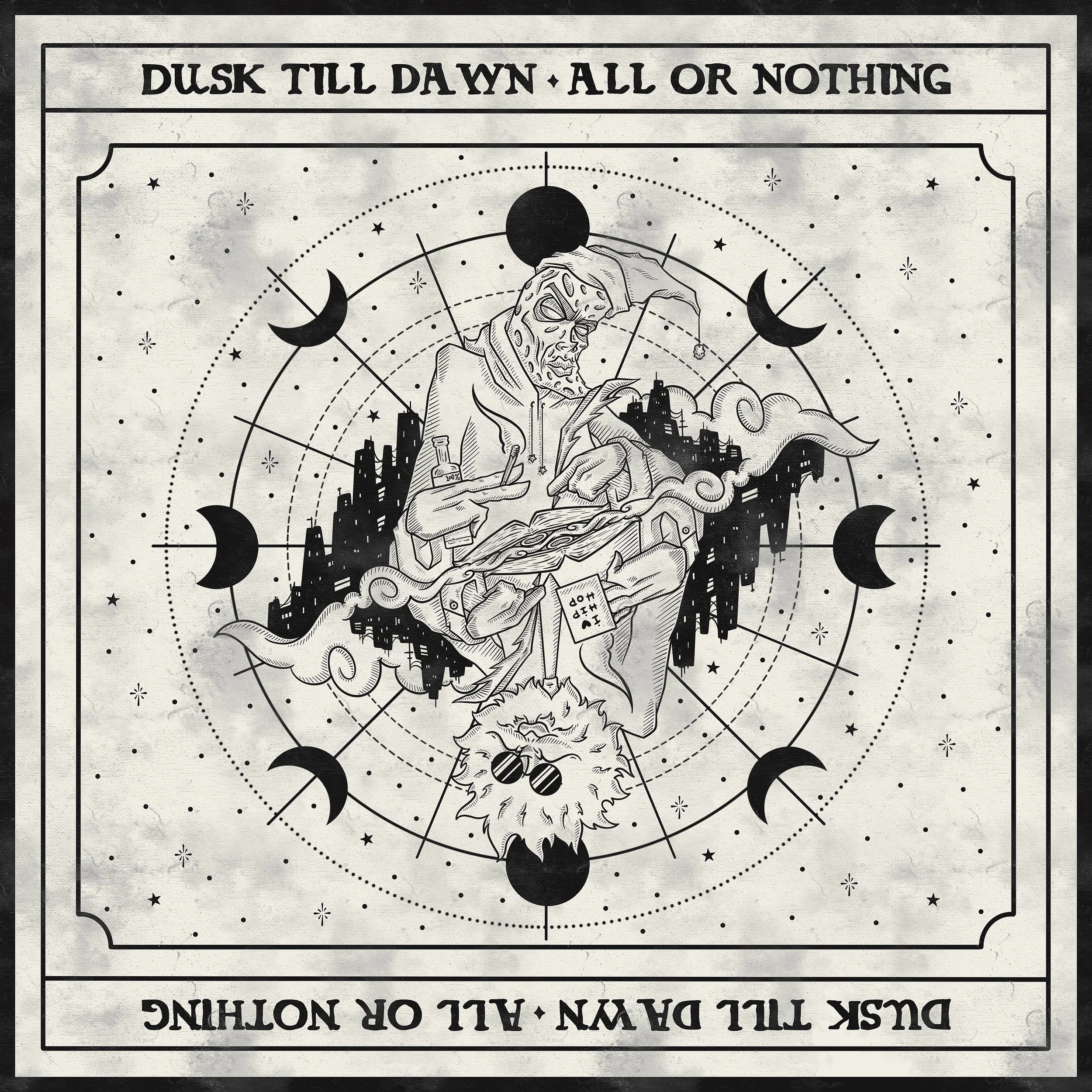
Front cover album art for @dusk_till_d4wn debut album “All or Nothing”. Released on @reefuzzrecords. Super dope first release from the duo @deaf_frets and @__zeroni. Both of whom, hail from the Caravan Collective camp. Real nice change of visual pace with this piece here. Sleven was just given a couple reference images for general vibes of the cover and then let loose to run with his ideas After some back n forth n a few tweaks, he came up with this. The piece utilises both the name of the duo and the album title to capture the nuanced dichotomy of what it is to be a lyricist or just a creative in general. Holding down a day job whilst grinding away at your art form, at any chance you get, from dusk till dawn. Or even if you create as a full time job, it's still a grind from dusk till dawn. And how it often feels that your creative outlet, your ART, is the only thing keeping you going, the only thing that could make you truly happy n give you purpose for being here, so you end up in a position of feeling you have to grab the preverbal bull by the horns and give your life to it or pack it all in, give up and enslave yourself to that 9to5, mortgage and 2 point 4 children, it's all or nothing baby!

Back cover for the album. Using the same moon and sun phases as the fron, just inverted to create a nice dark space fro the tracklist to sit on and standout
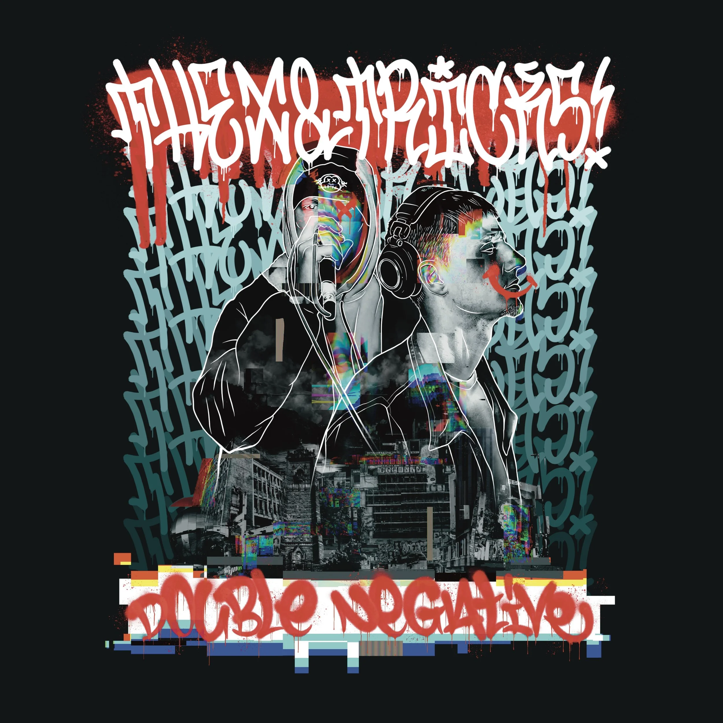
Cover art for The X & Tricks album Double Negative. Unfortunately, this never came to fruition with being finished and released, as is the case sometimes with cover for music. Real nice to work on though. It gave Sleven the chance to flex a more graphic design based piece, with a dose of greasy graff handstyles.
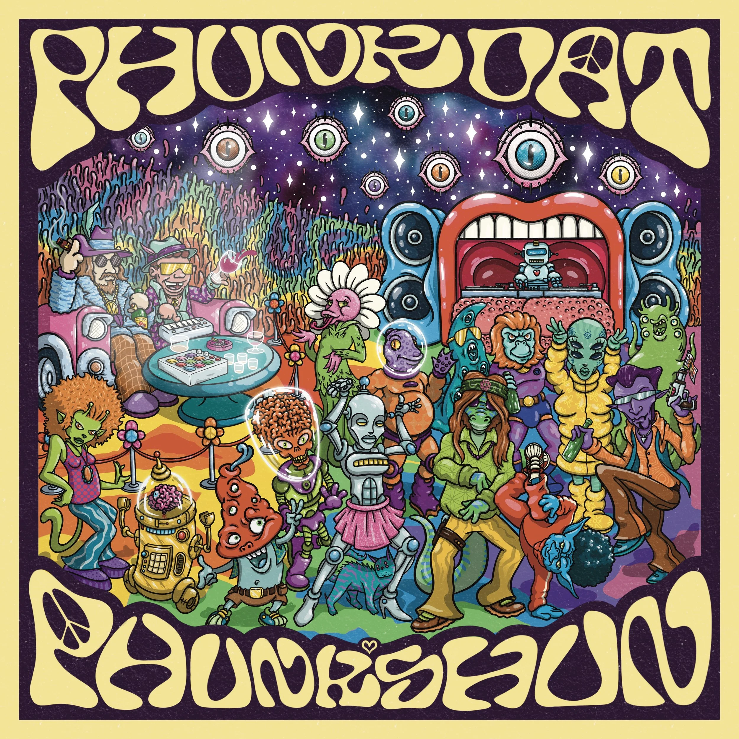
Digital cover art for @phunk_shun second track release PHUNKDAT. Out now on the @reefuzzrecords. The cover for this was loosely based on the cover art for an old Marvin Gaye record "I Want You". This was put forward as the intial idea from Phunkshun. Sleven ran with and came up with the whole trippy, spaced out, alien funk twist vibe, to keep in tone with the first record cover art he produced for them. This was an uba fun piece to work on, utilising well know sci-fi characters and turning them into funked out, retro, bootleg versions. And also adding a few of his own creations. The seat that Phunkshun are sat in, is made up of the front of the car they were driving on their first release. The colour palette, framework with lettering have been kept the same as the first cover piece. To keep a running design and brand continuity going. There's also trippy elements, such as the eye balls, mouth that's a DJ booth and mushroom character, that were also seen on the first cover but this time utilised in a slightly different manor.
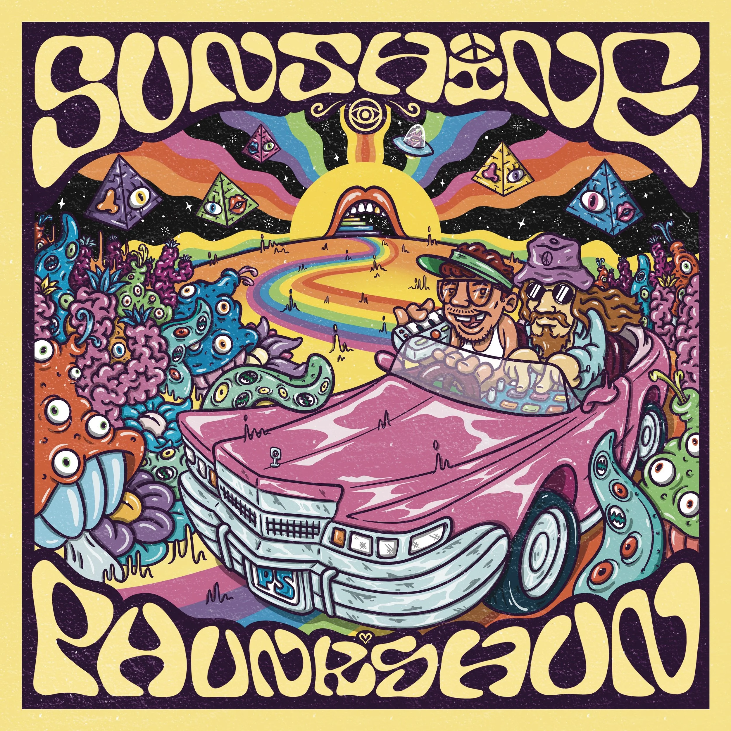
Digital cover art for @phunk_shun first single release "SUNSHINE". Released on @reefuzzrecords. This piece was so much fun to create. I was given a very loose theme, which was more of just some things that needed to be in the piece. Such as the characters and the car. The whole image leans into that whole trippy, outrageous, bold psychedelic funk aesthetic, which was pioneered by the likes of people like Bootsy Collins, George Clinton & Parliament FunKadelic. Running with that vibe, the main characters Boyce & Jack (whom make up Phunkshun) are on a road trip through time and space, in search for that sunshine funk!
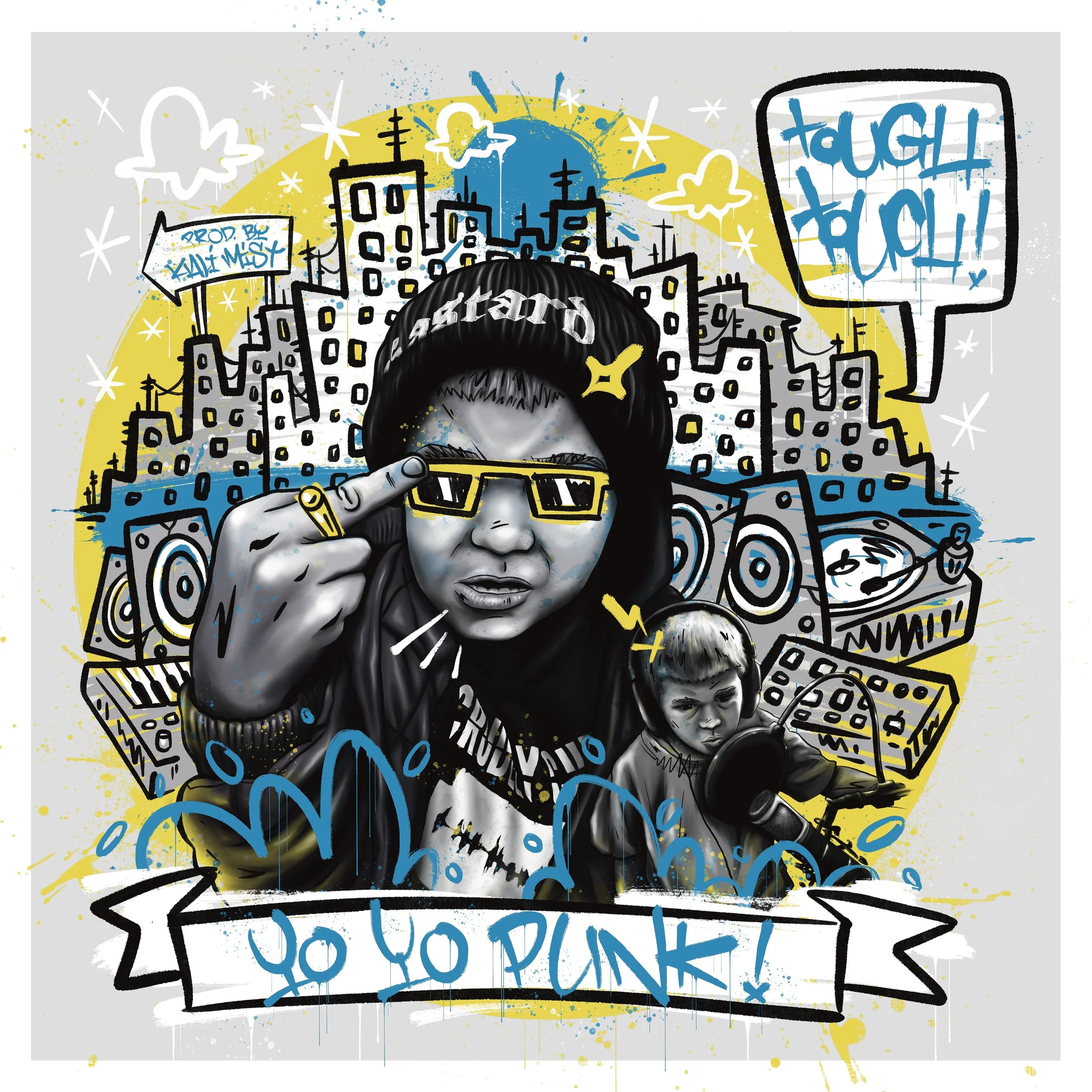
Album art for Bristol based hip-hop crew Tough Touch, titled "Yo Yo Punk!" Produced by one of the members @kali_mist1978. The crews a duo, made up of @socialconscience & @kalimist1978. The direction for the piece was based around some photos of Kali's kids he sent over and leaning into one in particular of his son, flipping the bird, which is very hip-hop & punk! So leaning into that, Sleven made the main focus piece that specific image, with a smaller one of his son in the studio by the side of that. And then the backdrops made up of a city scape and a selection of instruments that are usually used in the making of hip-hop music. Illustrated in a "child scrawling rough graffiti on bathroom walls or the back of their school book" style, which gives it a punk aesthetic and also ties it in with the tone of having the kids on the front & back cover.
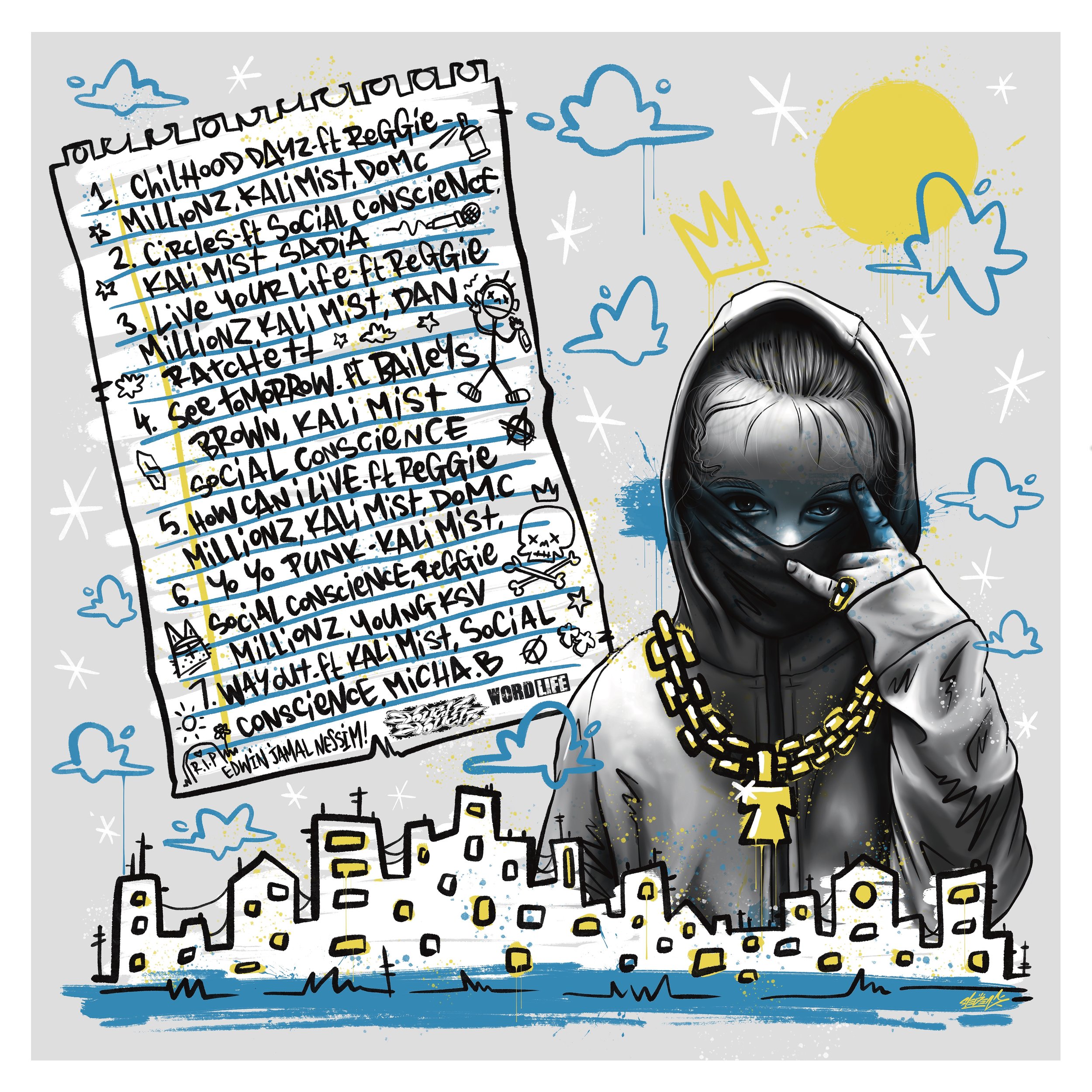
The back cover for Tough Touches Yo Yo Punk! The back includes Kali's daughter, hooded up, bandana over the mouth, big gold chain, throwing up punk rock devil hand signs! With the track list hand written in child like writing on a crumpled piece of lined school paper, to keep in tone with the whole aesthetic.
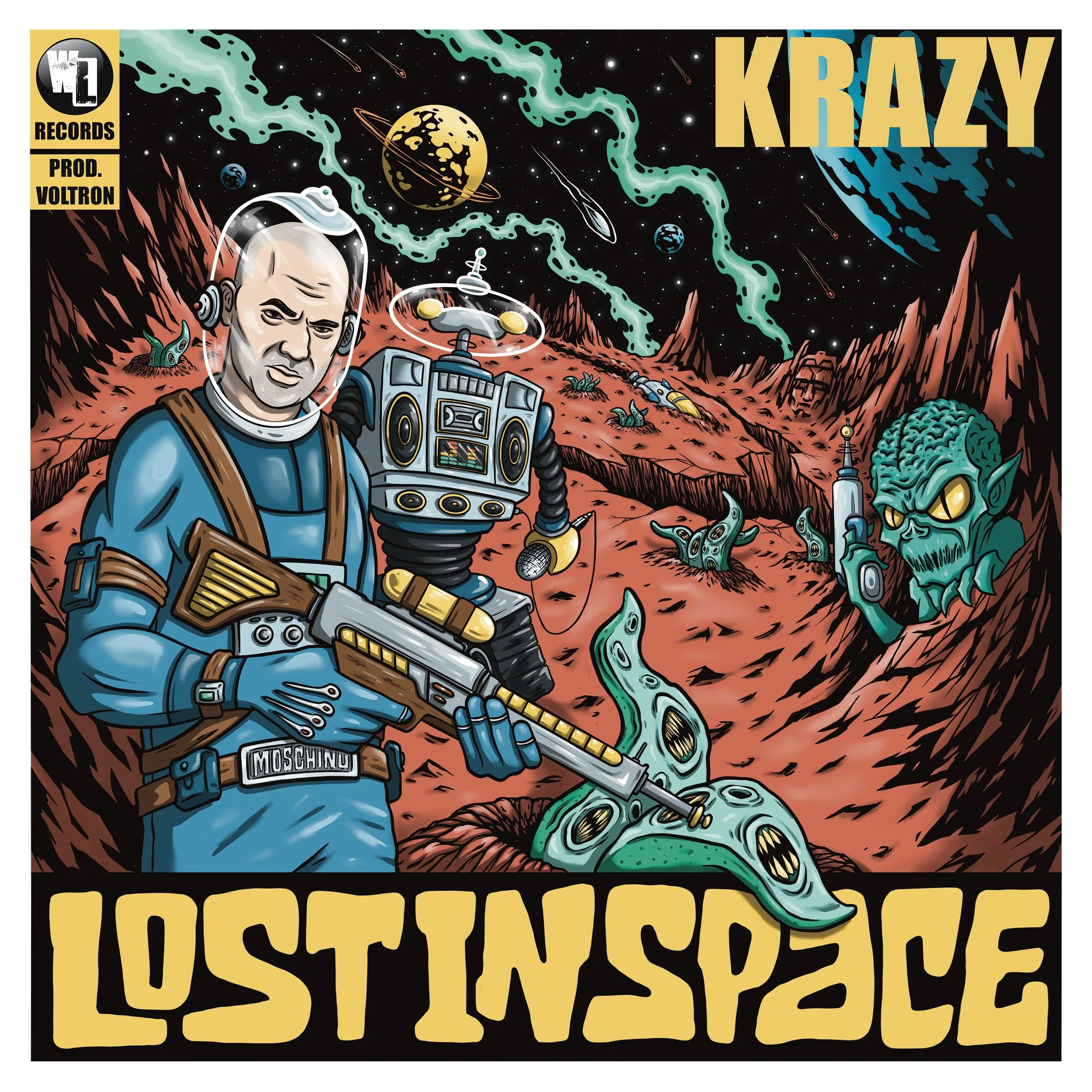
Digital album cover art for Bristol rapper KRAZY, titled "Lost In Space" For this one Krazy sent over a loose theme of space and wanting it to be in a comic book style format, to keep it cohesive with a previous cover Sleven created for him. Sleven created mood a board based around the 60s TV show of the same name LOST IN SPACE, with a few other sci-fi references from that era. Krazy was more than happy with what Sleven had come up with direction wise and let him loose on those ideas. Here's the breakdown of the cover. So there's a robot in the show, called Robot, who appears on this but with a hip-hop twist. He has a massive boom box for a torso and he's clutching a MIC, ready to spit some binary code atchya! Krazy's on point at front, with a laser rifle, scouting out the terrain for danger, like the head of the fam John Robinson would but donning Krazy's customary Moschino belt buckle. Man needs to be deeking behind him though, cos there's nuff danger there Will Robinson.........DANGER WILL ROBINSON, DANGER! Gracing the mountain scape at the back is the head of the cartoon character voltron. This represents Boyce, Def Frets & Zeroni, whom formed together like Voltron to produce beats for the album, alongside Krazy. The whole piece is illustrated in a comic book style, using a bold, simple colour colour palette and brought together with some striking font (the title font is in the same style as the original tv shows) and a corner box to keep in tone with the comic book cover aesthetic.
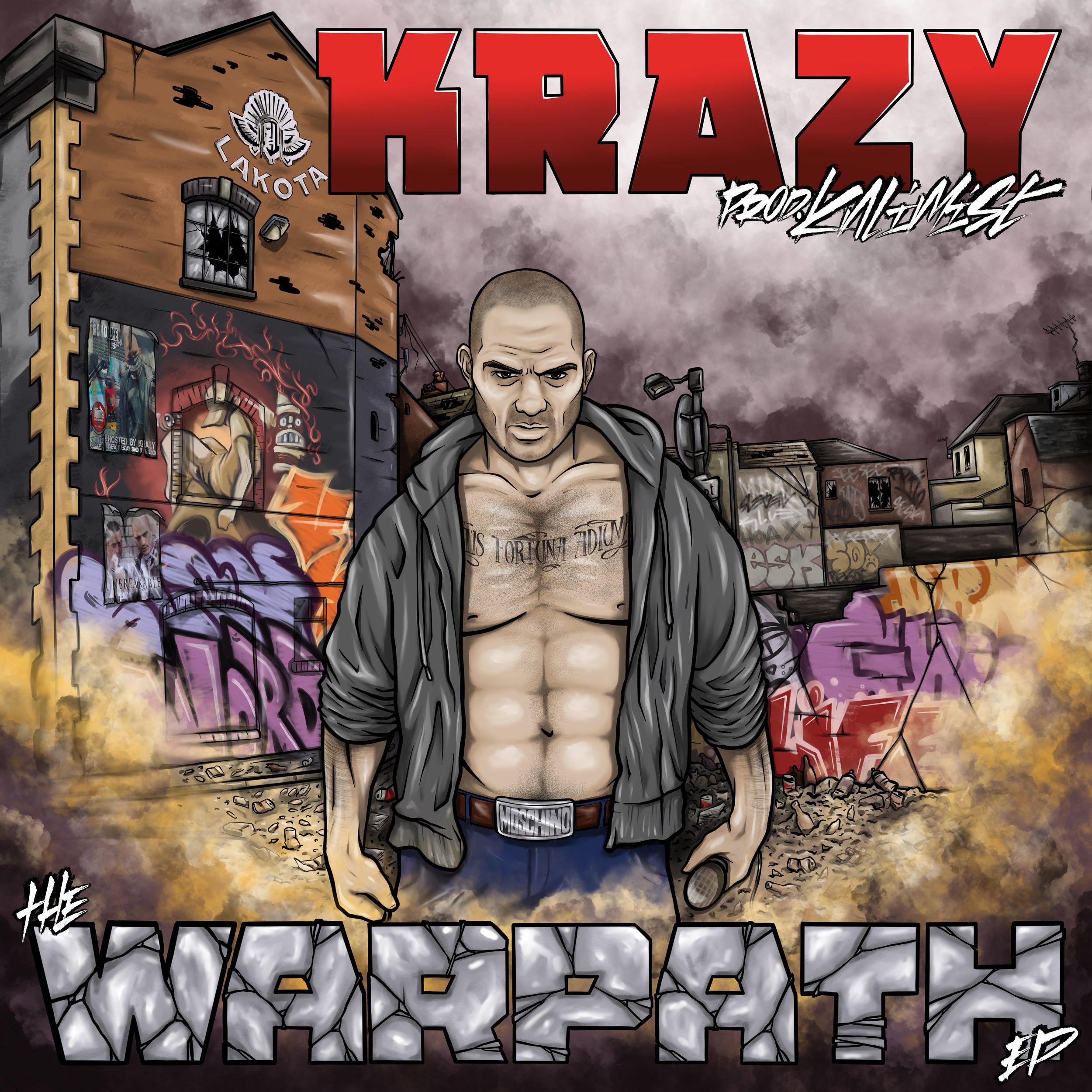
Digital EP cover art for rapper Krazy, produced by Kali Mist. Titled "The Warpath EP" Krazy came to Sleven with a solid basis for an idea of what he wanted for this. To have a comic book looking cover, something reminiscent of a HULK cover, seeing as the ep's called the warpath, a very HULKesk name, with hints of deadpool in there and some form of destruction in the image. We set the scene of the piece on a side alley street to the infamous Bristol club Lakota, which Krazy has played at numerous times in his career. The image stays in tone with the whole destruction aesthetic with the moody and atmospheric, dark stormy sky up above and a cloud of dust in the foreground, sweeping in from the piles of ruble in the background. All this destruction has been caused in the wake of Krazy on a lyrical warpath through the streets of Bristol. Krazy's donning his obligatory Moschino belt buckle, a mean AF looking stair and flexing his chest out as if he's about to HULK out! The font in the top right is the same style of font used in the deadpool comics, the font running across the bottom, similar to Hulk fonts and made to look like concrete, for extra gritty destructive tone and all tying the piece together for that overall comic book look.
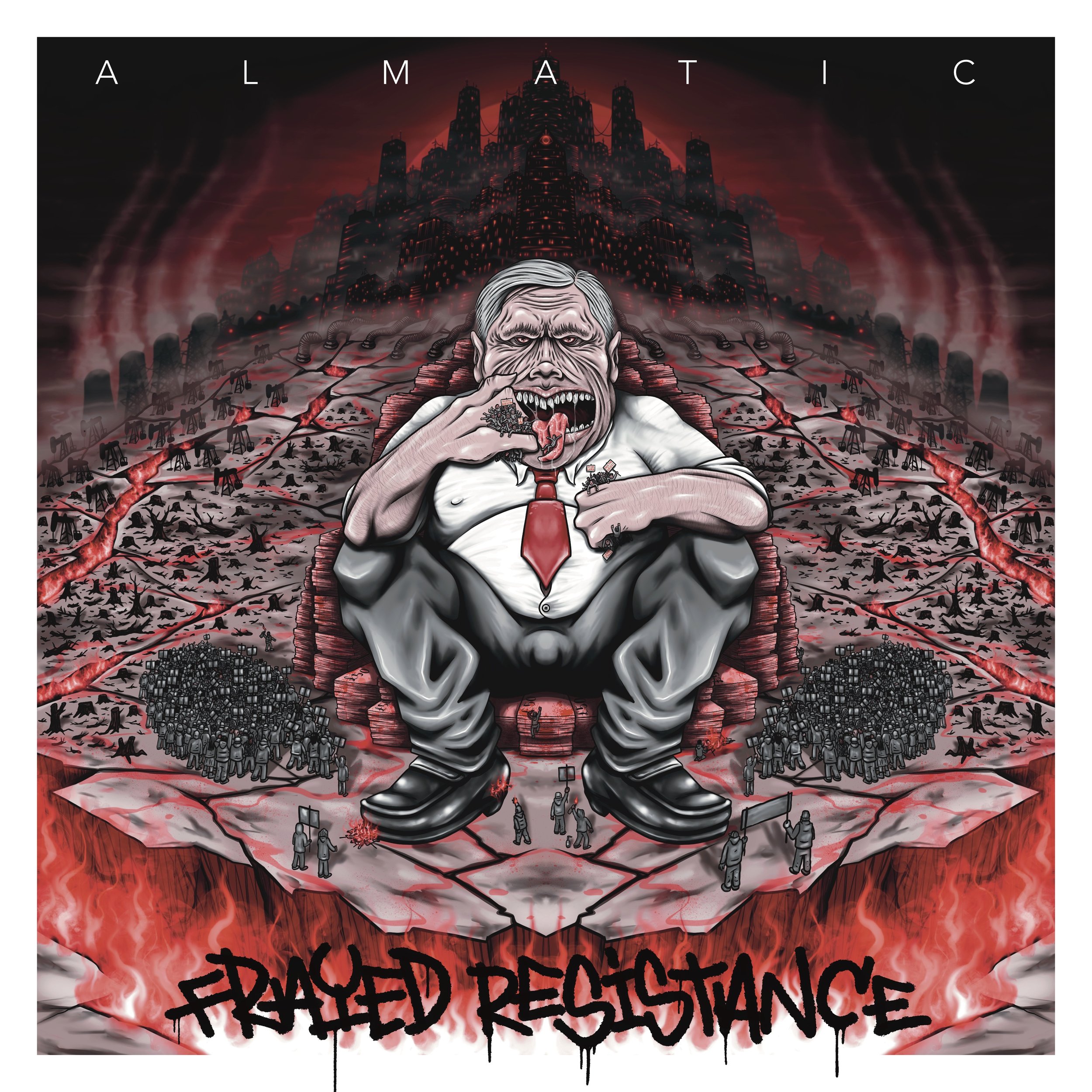
Digital cover art for Bristol based trip-hop group @almaticuk debut album “Frayed Resistance” So there's a lot of political unease within this cover. The demonic, pig like, politician sat on the thrown of money in the centre, with all the nodding donkeys and city scape of factory warehouses in the background, raping the land to the point of turning it into nightmarish hell scape, represent the corrupt and broken system we live in. The two crowds of protestors at either side of the demon politician, with a few staggered around his feet, they're all protesting, thye represent the resisting of the corrupt ways that are being oppressed upon us. Yet their resistance to the this nefarious overrule is being frayed by the cracks of detoxifying vents that are opening up the very ground they stand upon. These toxic vents are being formed by the corrupt destruction of the land, that the beastly system has been putting it through. And this resistance of righteousness is even more frayed by mr piggy politician, snatching them up and eating them. This whole piece is an astute visual representation of real life frayed resistance between the honest n righteous resistance of the many, against the elitist cabal of political & corporate few that make it harder and harder on daily basis to resist their diabolic overruling. Took a few iterations to get to this piece but the outcome was worth it. This is the original cover in red monochromatics but the group ended up using a different colour for the finale release. Which can be seen in the next image.
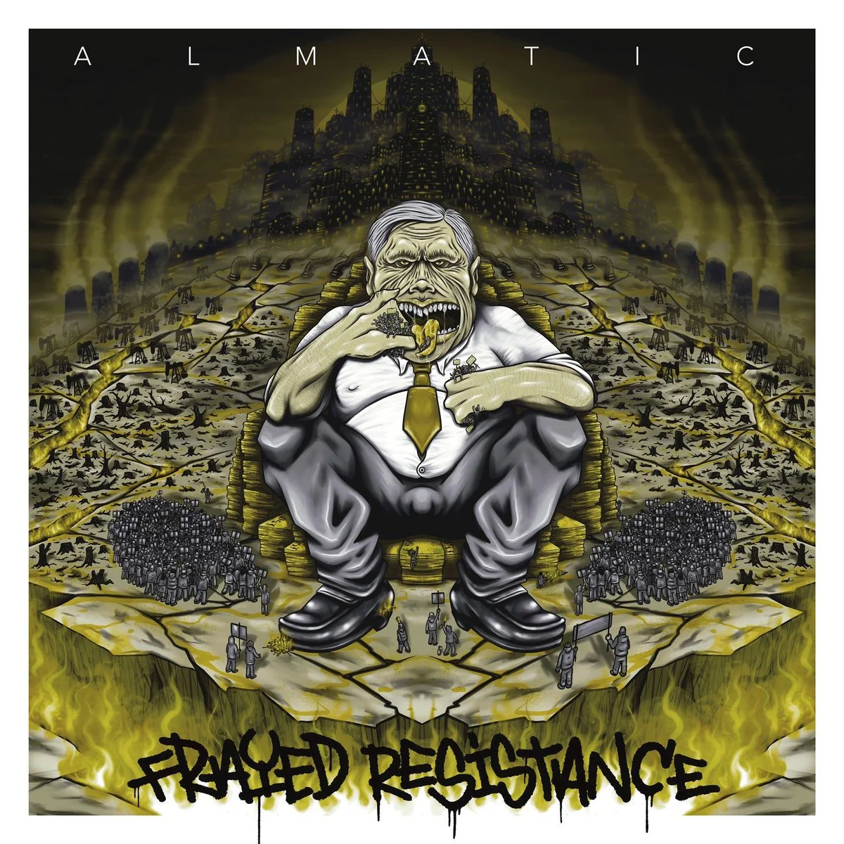
This is the cover for the Almatic debut album that ended up being used for release. The colour of this one gives it a more of a "you're choking in our polluted, toxic, earth destroying fumes vibe", where as the original red one, more of a "we've all gone to hell from all the toxic shit we've done to planet n now we're just burning in hell!' Both work really well with what the cover art is about.
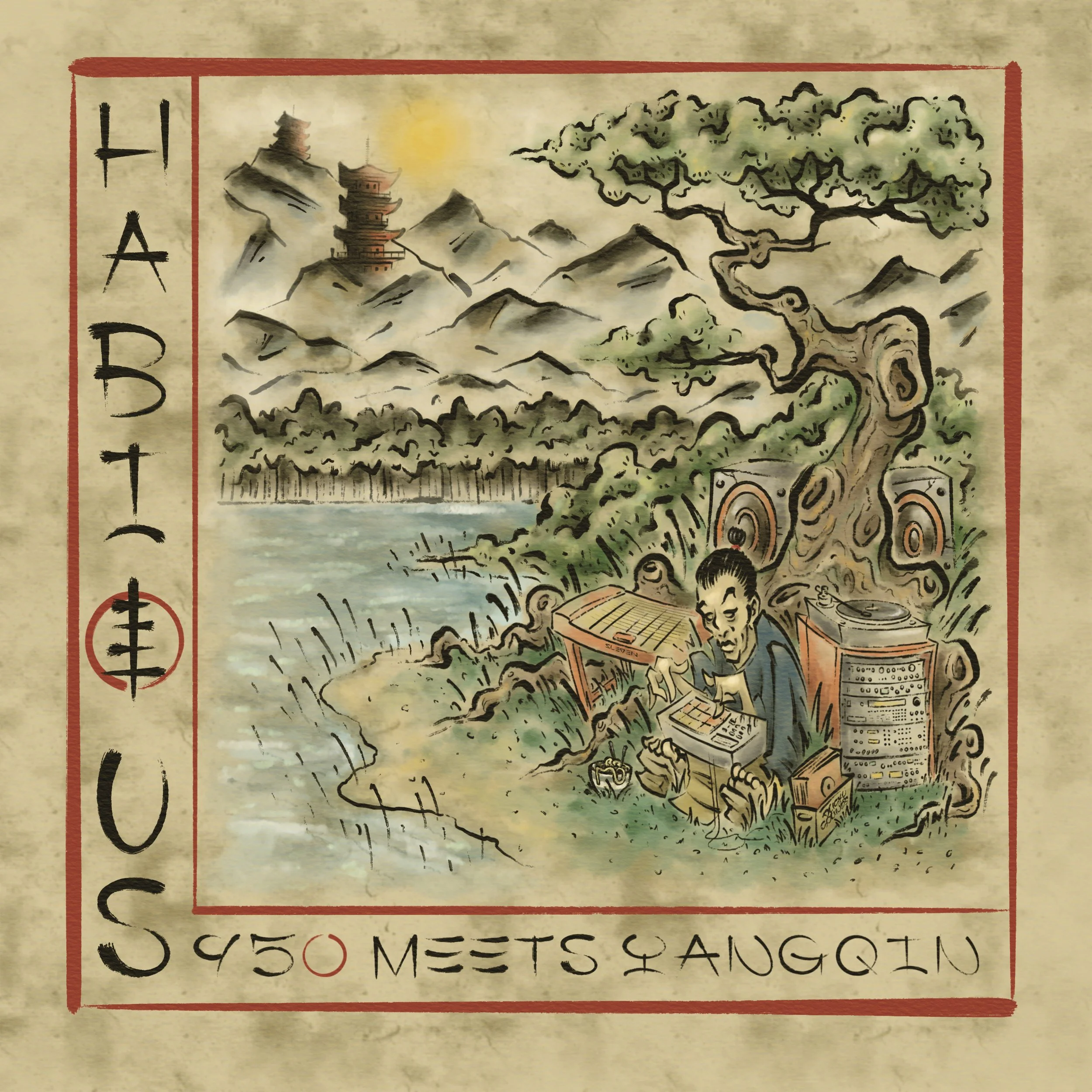
Digital cover art for a Habitus beat-tape album "S950 meets Yangqin". Definitely one for all the slung-back Shaolin boombap heads out there. This piece is very much a visual interoperation of the the music. It's got them ancient Chinese vibes that you feel from hearing the Yangqin being played and all perfectly blended together with modern studio equipment, in a hop-hop style with an added touch of raw dusty beats. Sleven was pleased with how this turned out and getting the chance to create another piece of visual art for the music of a very close friend and brother, mr Habitus.
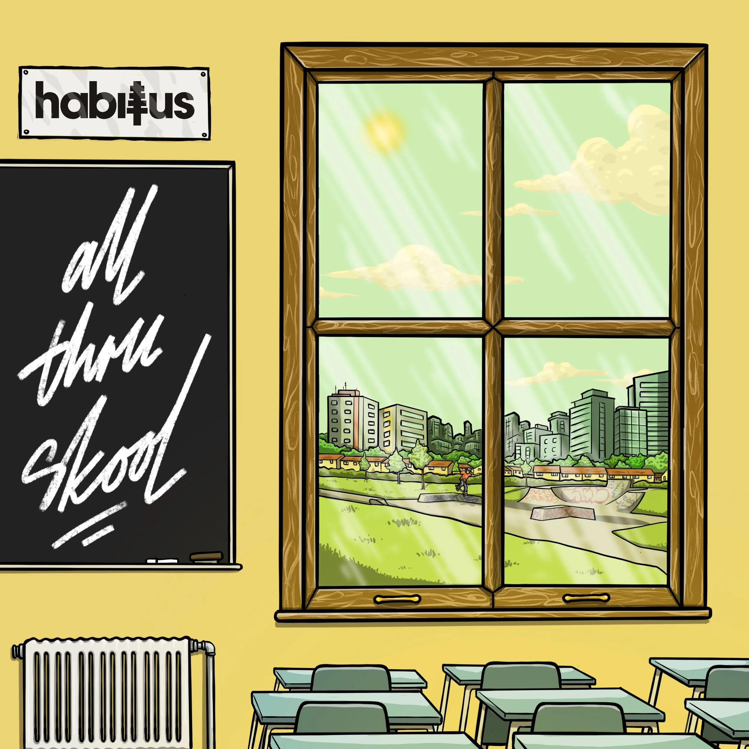
Another digital cover art piece for Habitus. For another beat tape of his "All Thru School" Real quick turn around on this, also simple & to the point bit of illustration.
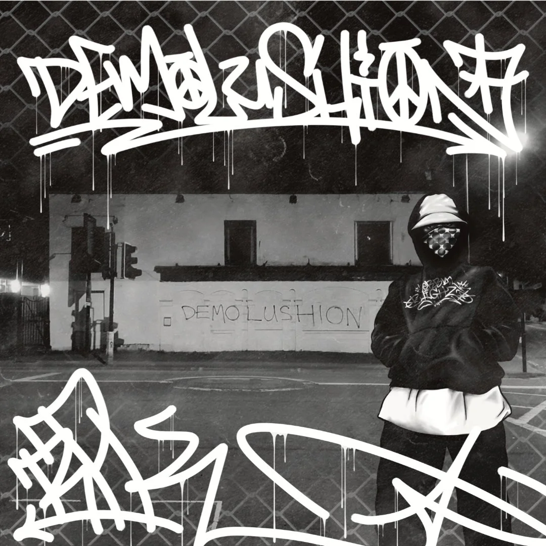
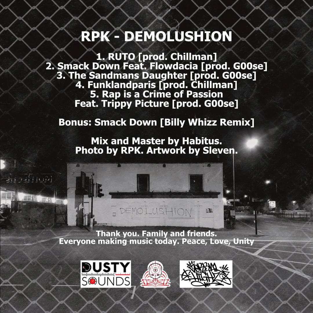
Cover art R.P.K 's first EP release. Titled "Demolushion" Concept for this was very simple. PRK had a photo of building he'd scrawled the title of the EP on. He just wanted the photo jazzing up a bit. Sleven decided it'd be a good idea to get an image of RPK in the photo. They took some photos of PRK for reference, looking all gully n gritty (to keep in tone with the photo). Sleven then illustrated RPK, laid that over the photo, added some faded wire fencing for extra griminess and then the text, in a crisp white, drippy mop handstyle to bring it all together.
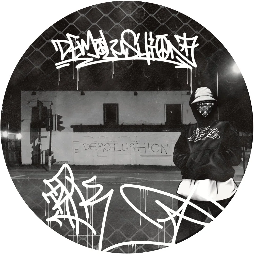
The front cover for Demolushion was just repeated onto the CD for this.
Back cover for Demolushion was just the same photo as the front but zoomed out so you can see more of the image. Keeping the faded wire fence and adding clear bold white text.

Album art for Zetdokadope. Titled "Victoria" Zet had a loose idea of what he wanted for this cover. A stone statue of the Goddess of Victory, Victoria.


Digital cover art for a @b_l_u_e_t_t single release, titled "Ill Fate" featuring @scorzayzee. Real quick turn around on this as Bluett needed it nocking up within 24 hours. He had the idea of a crypt keeper, in a cemetery, with a time piece in his head, which fully appeased Slevens' darker side. Sleven kept it very simple for the quick turn around by just using a classic dark horror colour palette of black & red. Having the background as just one solid colour of red and rough black lines, with a touch of white highlights.
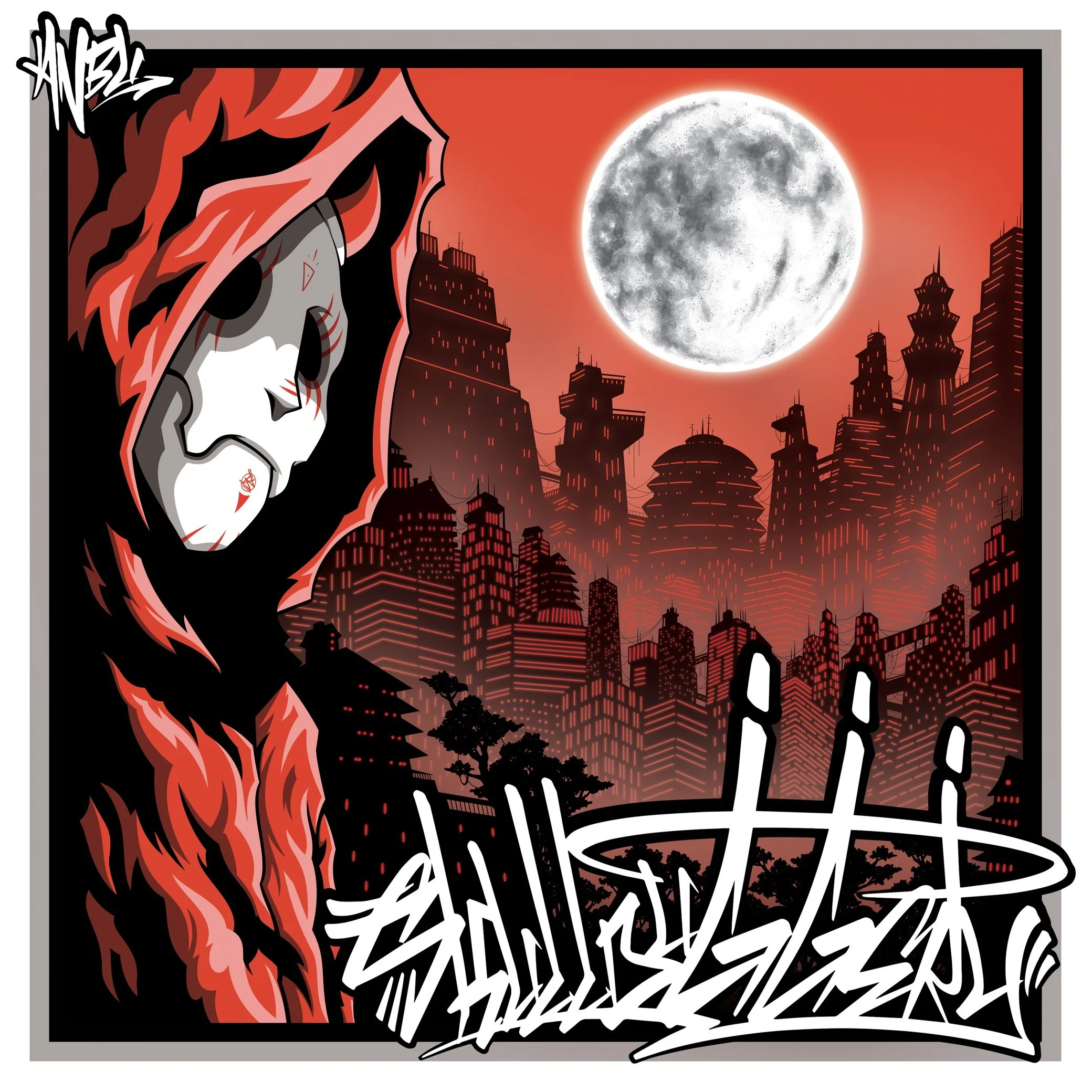
Cover art for the late, great, legend, Flying Monk aka ANBU! His debut EP "Skullduggery". Anbu gave Sleven one direction with this and it was to have a character with an anbu mask. So keeping in tone with the black ops anbu characters from neruto, Sleven went with a dark anime style and background, with graffiti handstyles to bring it back to ANBU's Bristol hip-hop roots.
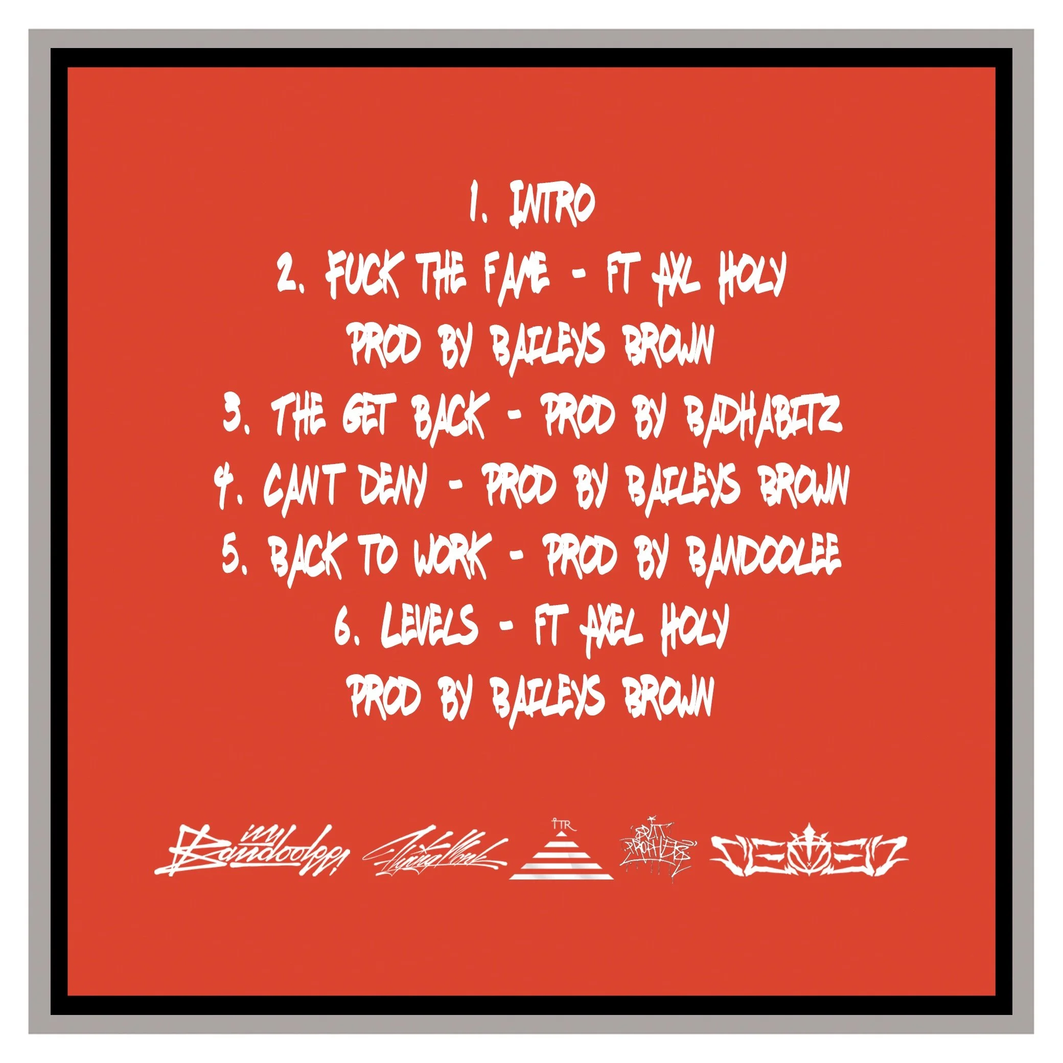
Back cover track list for Skullduggery.
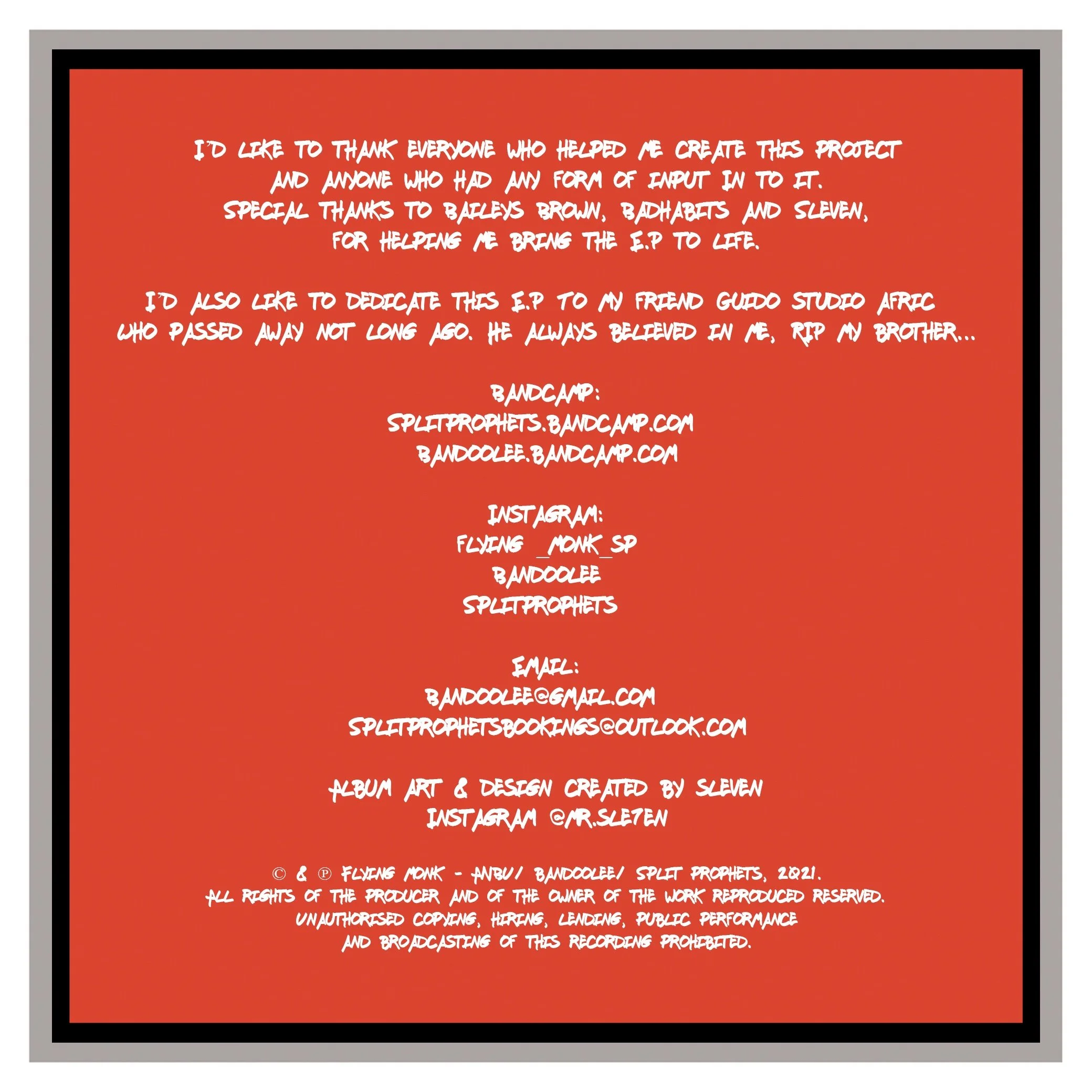
Inlay shout outs for Skullduggery.
CD design for Skullduggery, keeping it nice and simple.
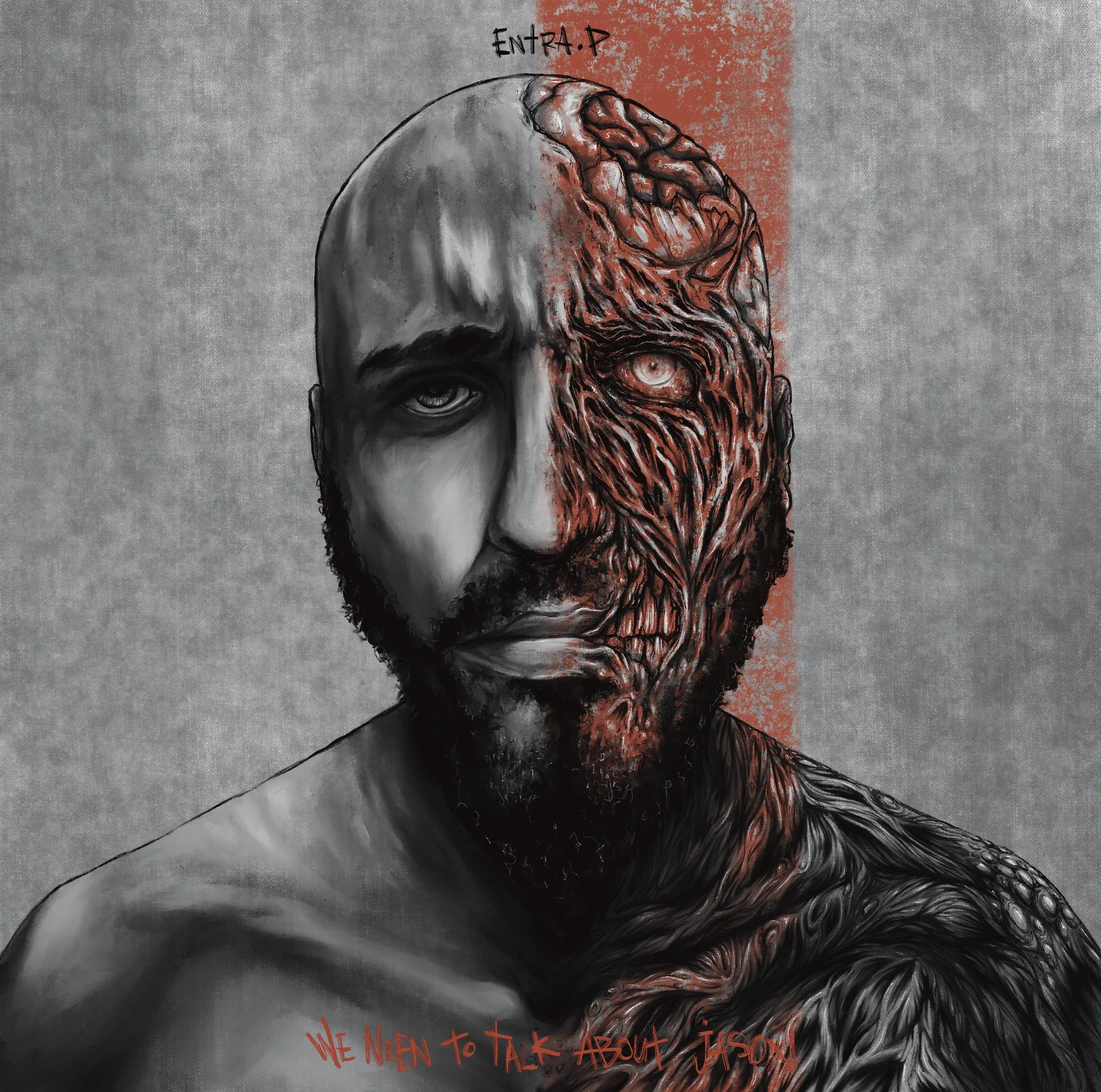
Cover art for Entra P. Titled "We need to talk about Jason". Unfortunately this was another finished album cover that never saw the light of day for numerous reasons.
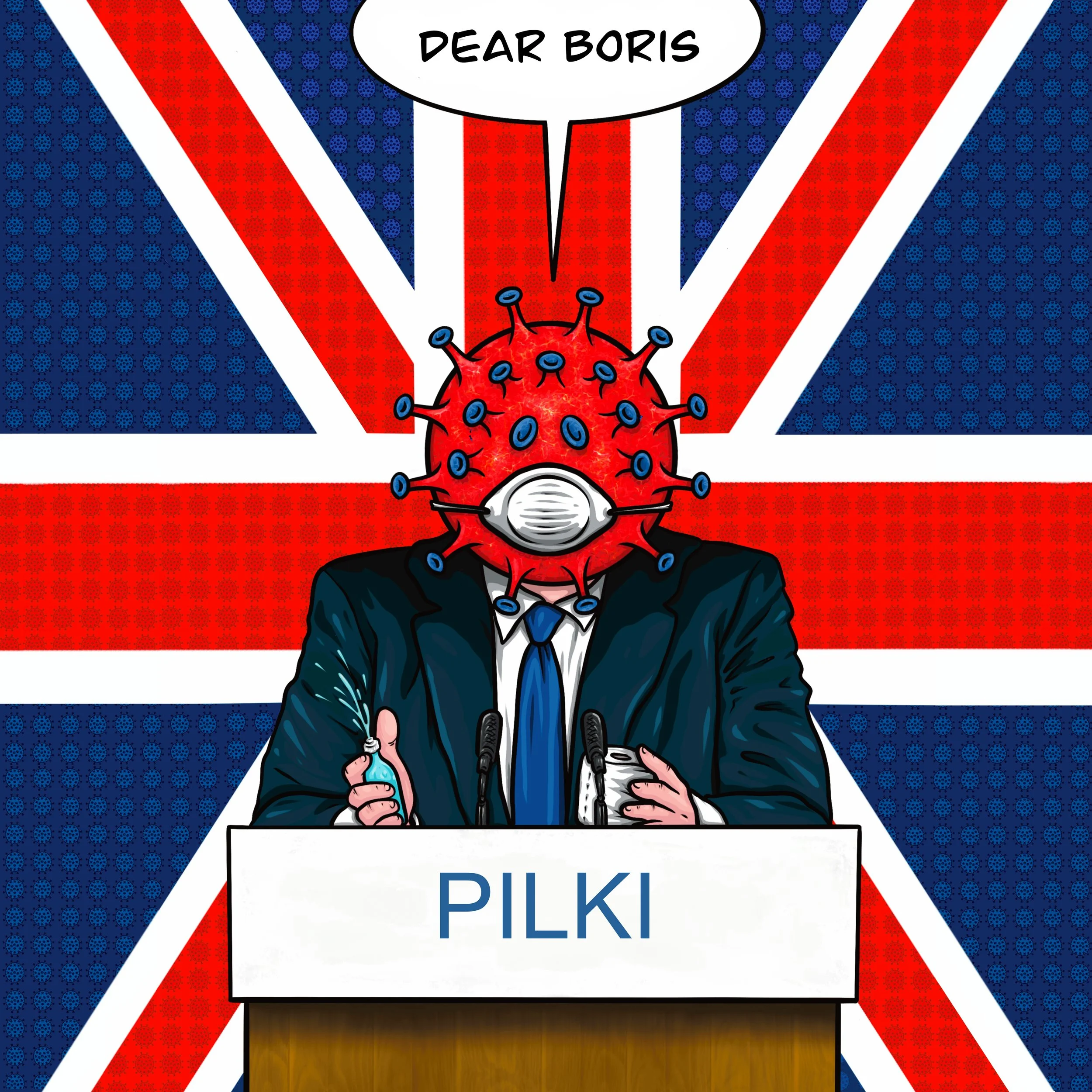
Digital cover for PILK. Single release titled "Dear Boris". This image was originally created by Sleven during the first lockdown in the UK but it had different text on the podium and in the speech bubble. To see that image, head over to the World War C gallery section. Not long after this image was created by Sleven, Pilki hit up Sleven asking to use the image for a track he'd recently written about the prime minister Boris Johnson, whom was in power at the time and handling the the whole covid farce appallingly. The image was completely apt for the track he'd written. He just had the request of changing the text, which Sleven was more than happy to oblige to.
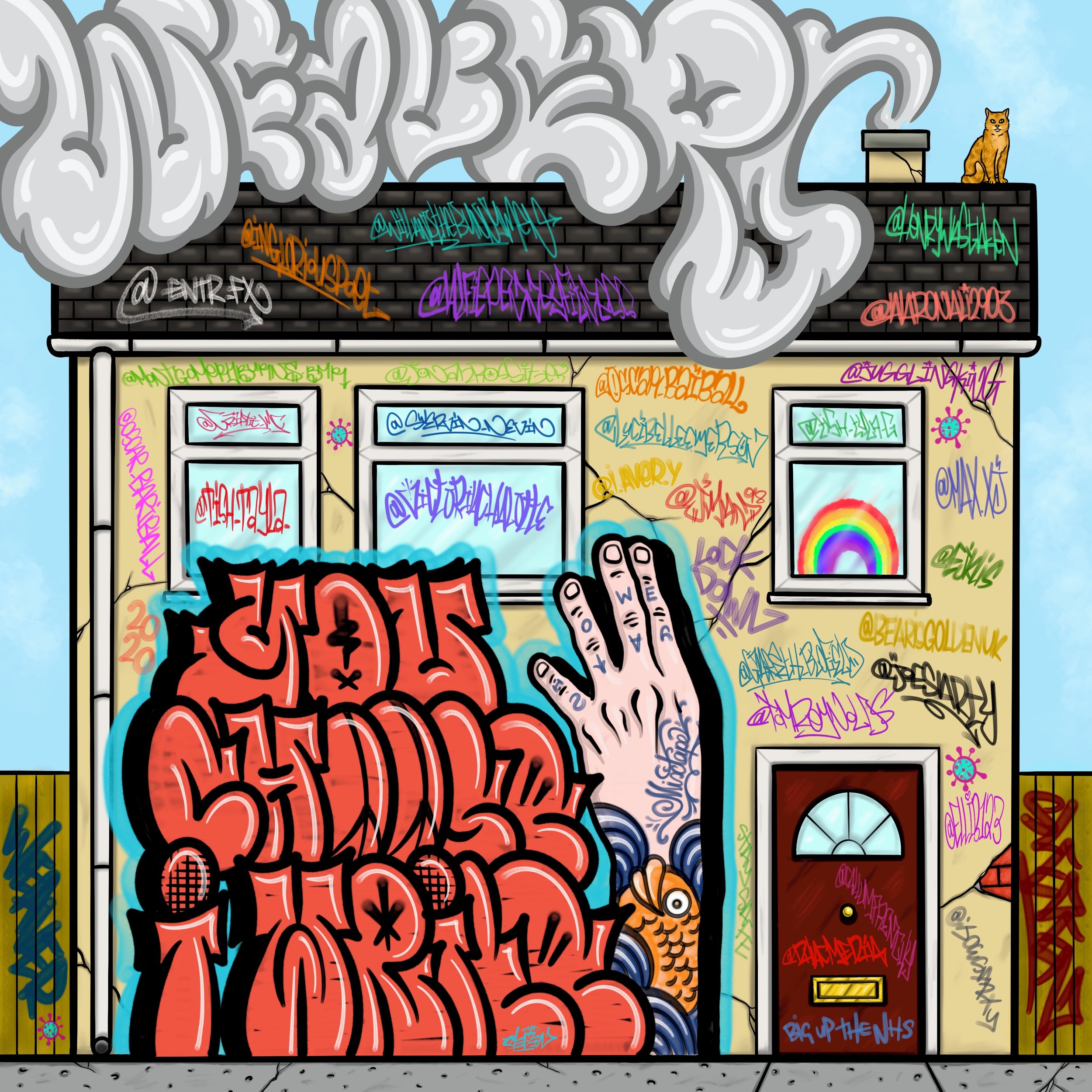
Digital cover art for @weaver.uk Titled "You Choose, I Write" Created during the first lockdown. This album is a concept album. Where Weaver asked his followers during lockdown, to give him a random subject every day and he would then write bars about that subject on that day. This was done on a daily basis for 28 days and then turned into this mixtape. The idea for the cover was to represent lockdown and have all the names of his followers who contributed subjects, that got turned into tracks. So the solemn detached house represents everyone been lockdown in their houses. With all the @ tags on the house plaguing the house like covid are the instagram handles of the followers that contributed concepts for each track on the album.
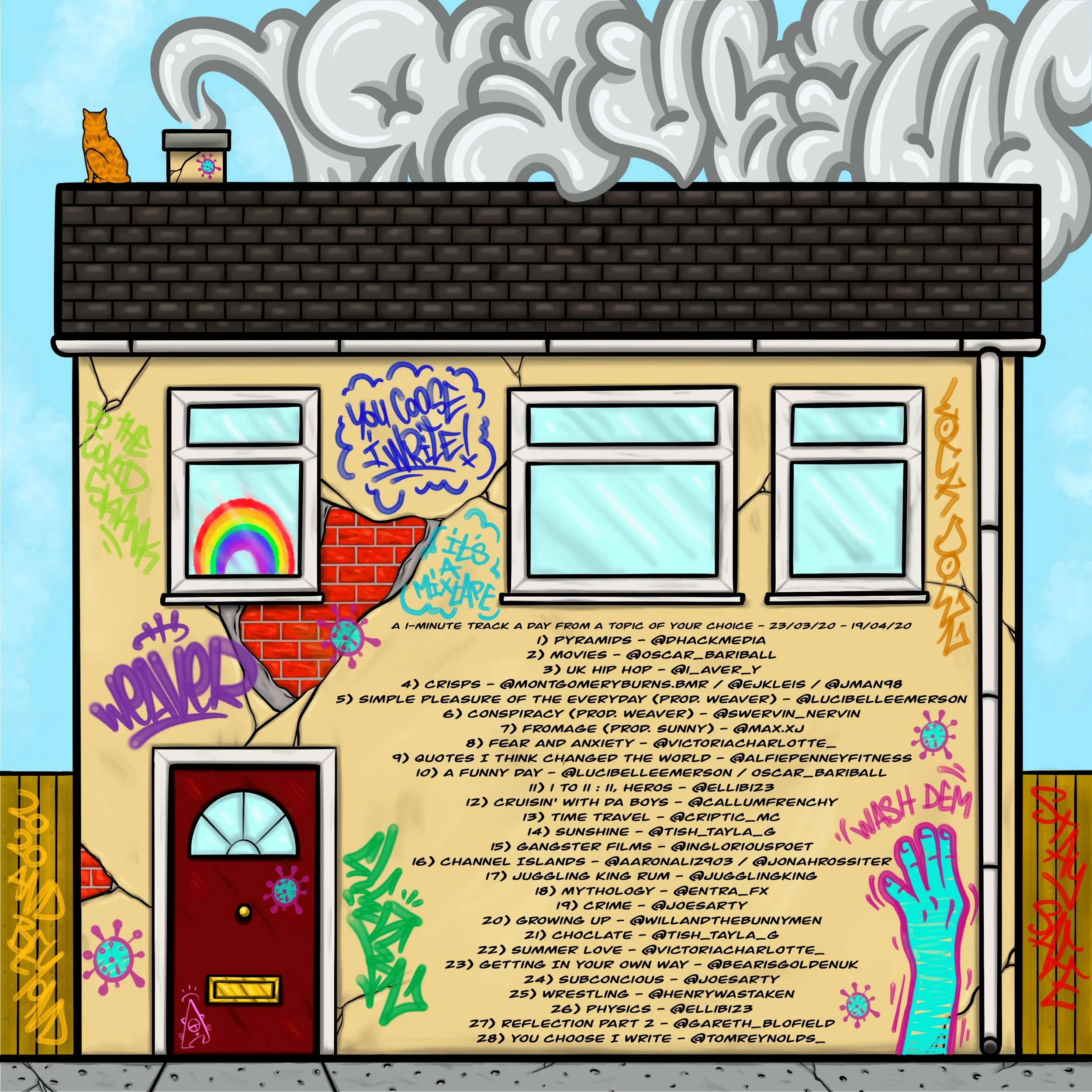
Back cover for Weavers lockdown concept album. Made sense to just have the back of the house for the cover. With more space to get full details of all the followers on the track lists, plus a bit of extra covid inspired graff.
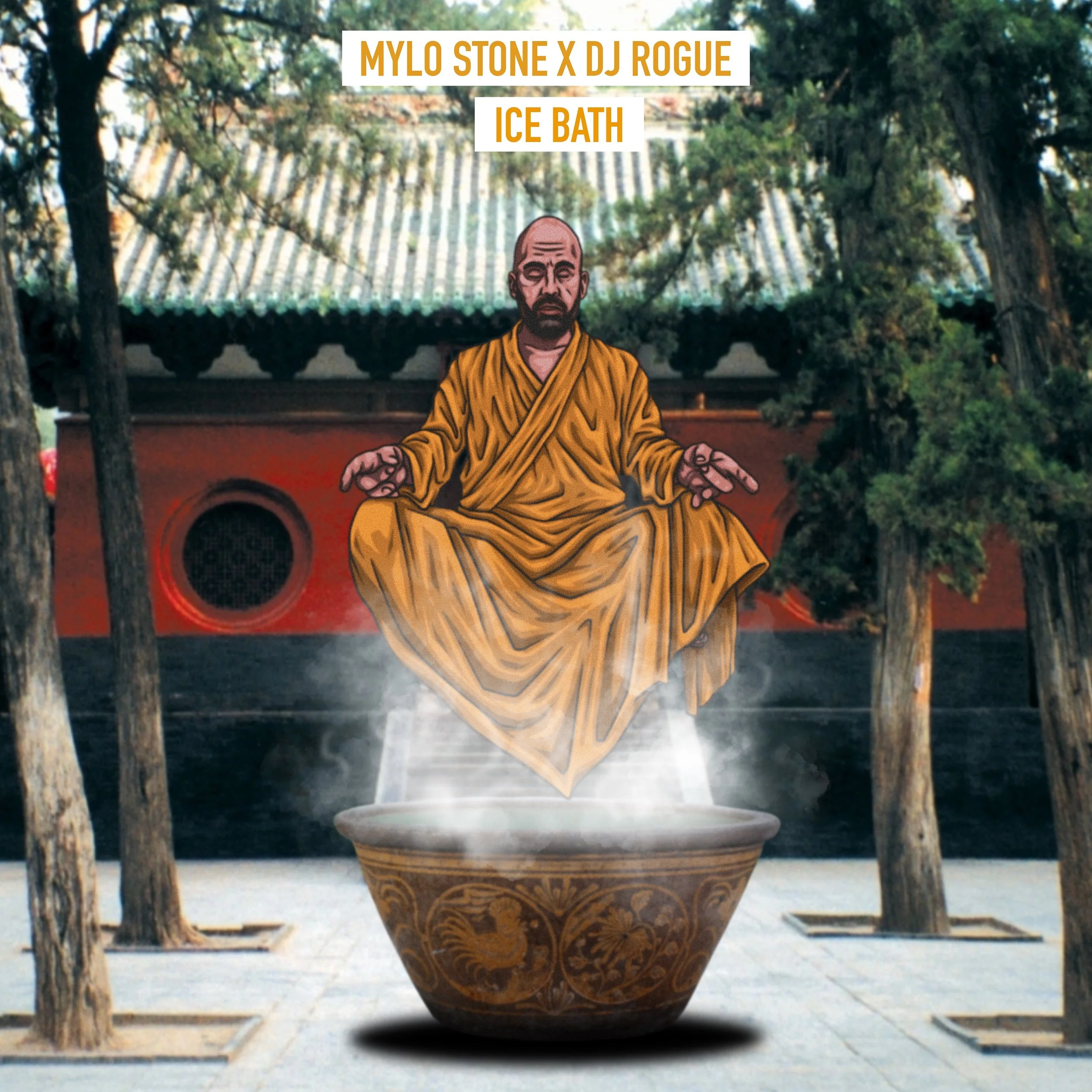
Digital cover art for Mylo Stone X DJ Rouge. Titled 'Ice Bath'. Mylo came to Sleven with a solid idea for this. Making the process quick and easy to churn out. He explained to Sleven about his recent journey into meditation, ice baths & sobriety and changing his mind state, keeping shit zen! And how he wanted something representing that, like him in a meditative position floating over an ice bath. Sleven ran with the whole Zen meditation vibe, scoured the internet for some dusty, grainy looking photos of Chinese temples & ice baths, till he found what he was looking for. He wanted to use photos instead of illustrating the background to give it more of a old skool kungfu flick vibe, seeing as Milo was on somewhat of Shaolin warriors path himself.
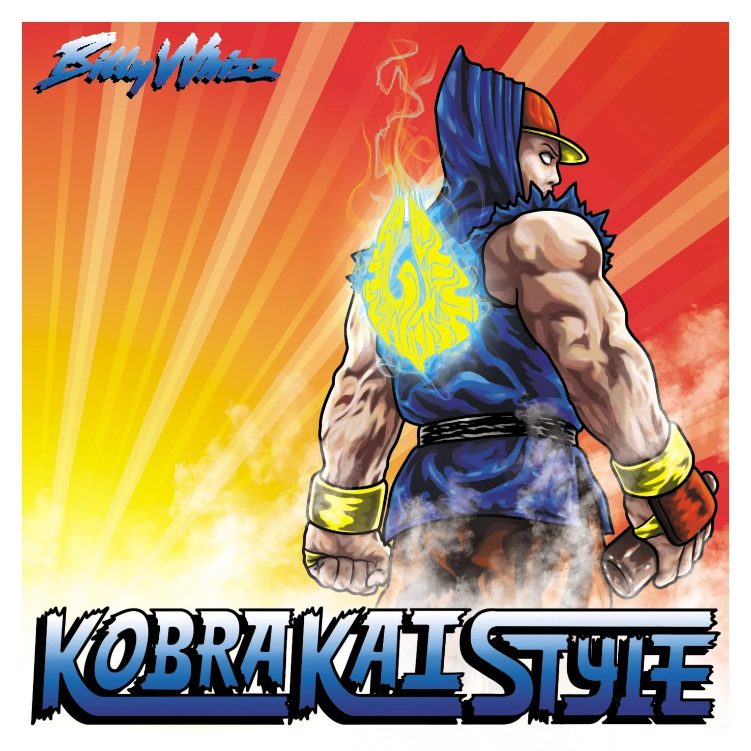
Cover art for a Billy Whizz EP. Titled "Kobra Kai Style". Billy wanted to lean into the whole Kobra Kai & Street Fighter aesthetic with this one. Ryu from Street Fighter was taken as the main focus for the piece and as a character presentation of Billy. By adding the snapback and bottle dragon stout in his hand. The flaming Billy Whizz logo on the back also adds to the representation, whilst also utilising his branding.
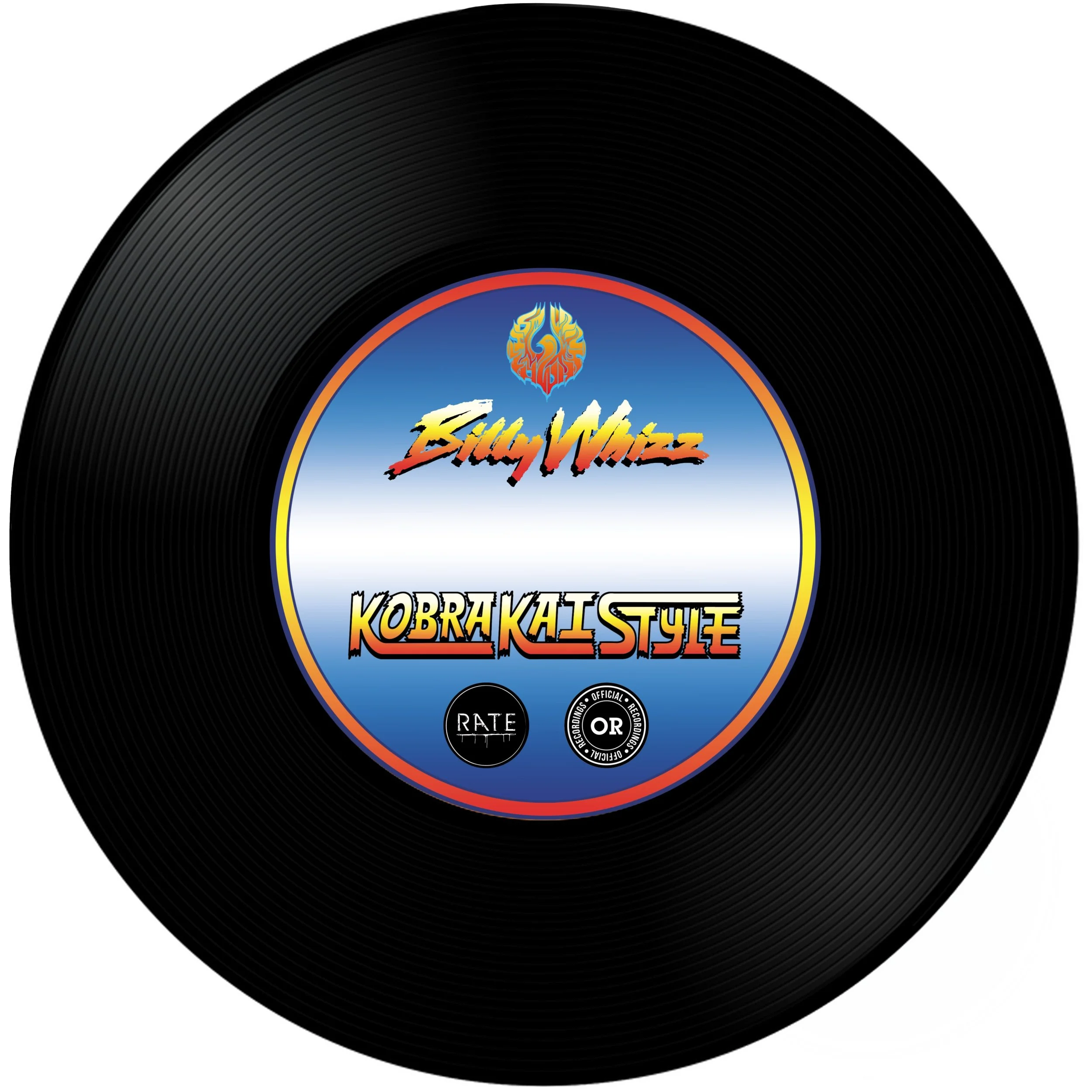
CD cover for Kobra Kai Style. Going with a vinyl record look to keep in tone with Billy's DJing roots.
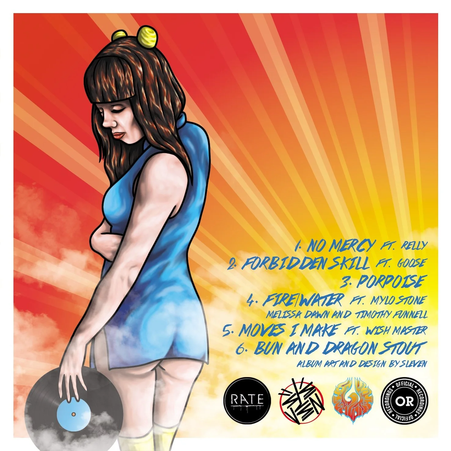
Back cover of Kobra Kai Style, featuring one of Billy's friends as Chun-Li, grasping a vinyl record, ready to fling at any suspect looking groupie! Also aligns with Billy's known skills as a DJ.
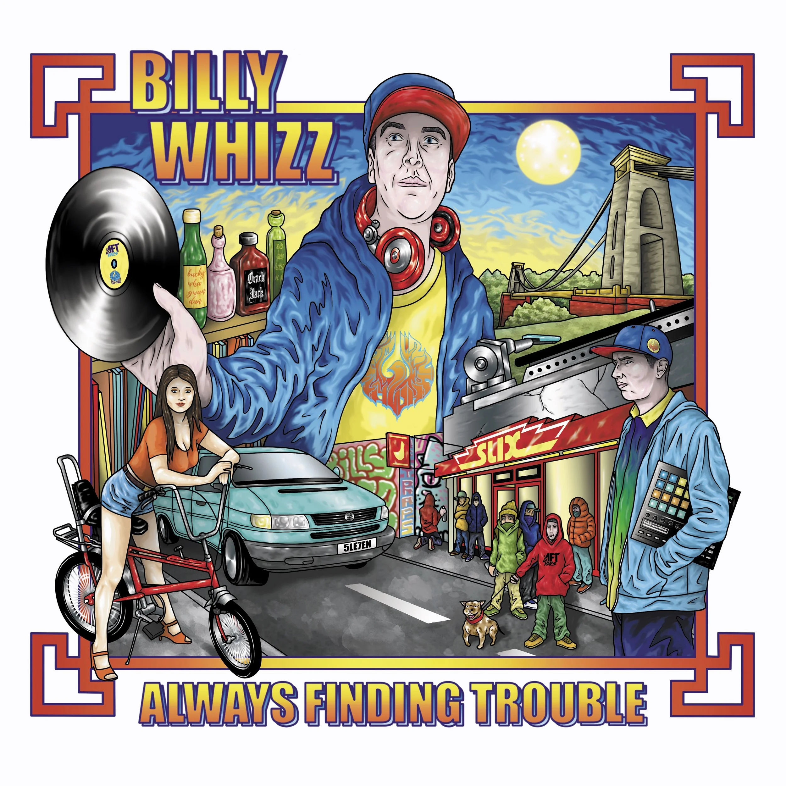
Cover for Billy Whizz EP. Titled "Always Finding Trouble". The idea behind this was from the poster art from the film Big Trouble In Little China but a day in the life of Billy based around a Bristol backdrop, where he resides. We have the Bristol bridge in the background, along with a shelf of some of the cities finest tipples, such as buckfast! The infamous SLIX chicken shop on stokes croft, a regular haunt for the venues Billy can often be found playing at. The lady at the front is a stride on Billies beloved chopper bike. The WV on the road Belongs to Habitus, a friend and colleague of Billy and also the guy who supplied the studio to master the EP. And at the front another image of Billy, holding the MPC he used to create the EP with.
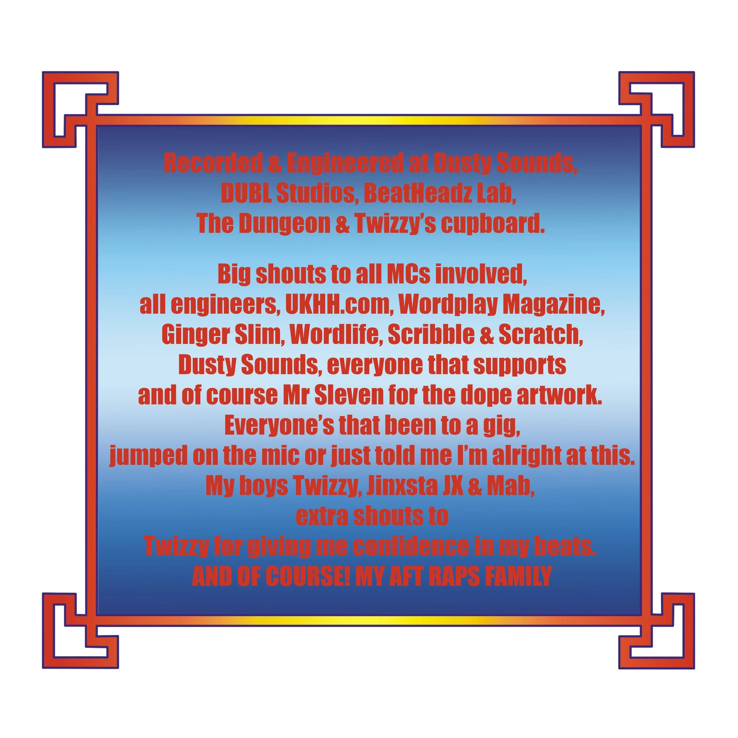
Inlay shout outs for Always Finding Trouble album, utilising the frame work from the front cover.
Image of what was printed on the CD. Vinyl record to keep in context with his DJ roots.
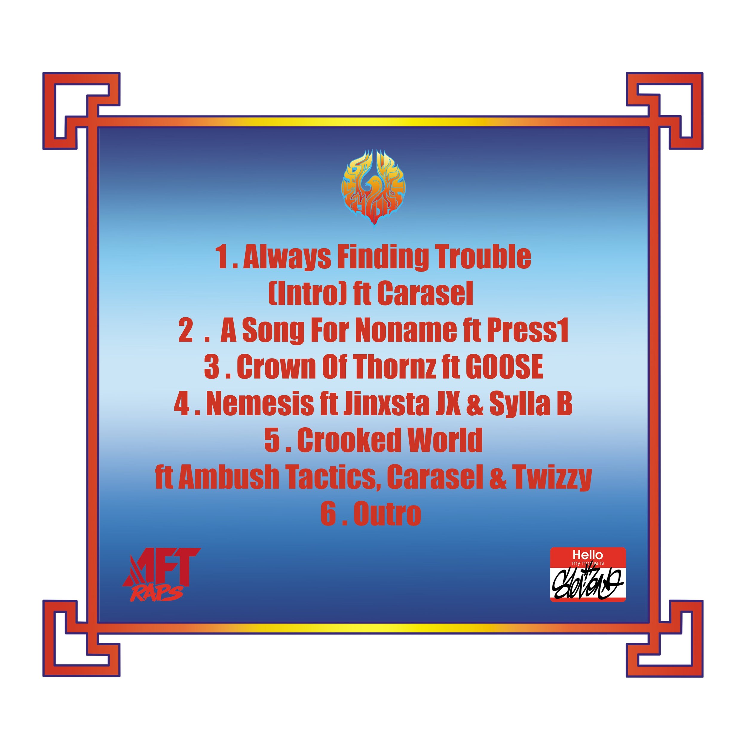
Back cover track list for Billy Whizz Always Finding Trouble album
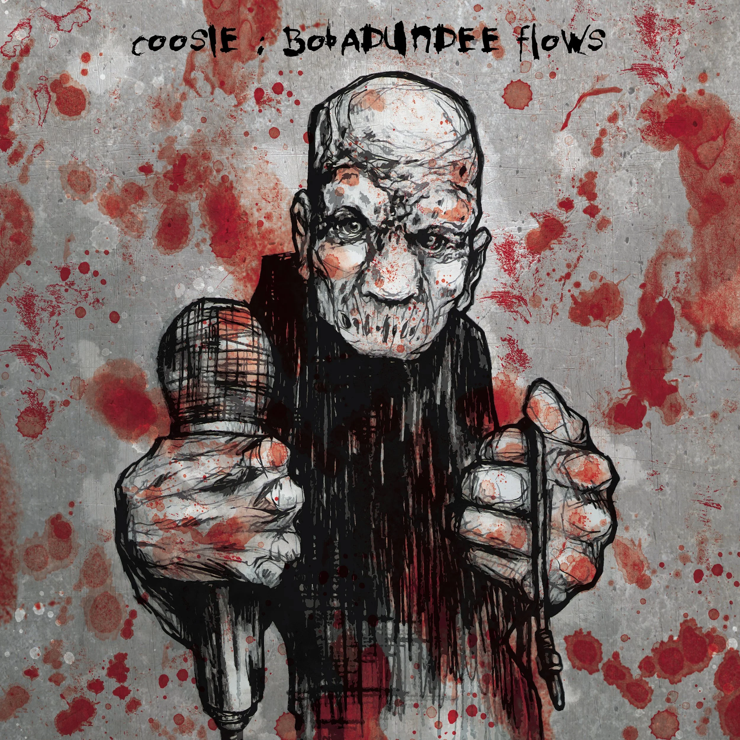
Cover art for Coosi, debut album, titled "Bobadundee Flows" The idea for this was was based on a drawing Sleven drew of one of the night time friends he saw one night, mid sleep, in that space between the physical realm and dream realm. Coosie saw this image and told him he wanted to use it for his album art as it was perfect representation of babadundee. In the original, the character isn't holding a mic so this was added to represent MC. A rough steel background, stained with blood, that complements Coosies cold, heavy, brutish and gritty lyrical style.
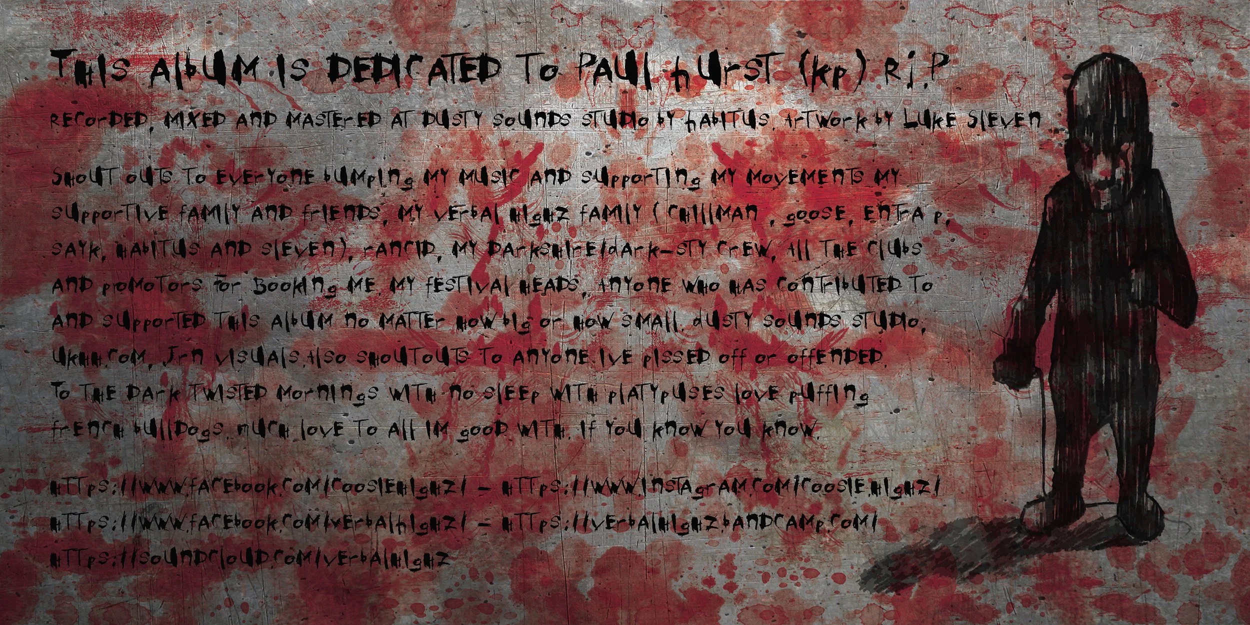
Inlay shoutouts for Bobadundee. Keeping it dark, gritty and bloody, with a silhouette of Bobadundee.

CD for Bobadundee flows. Same as the front cover with slight different placement of text.
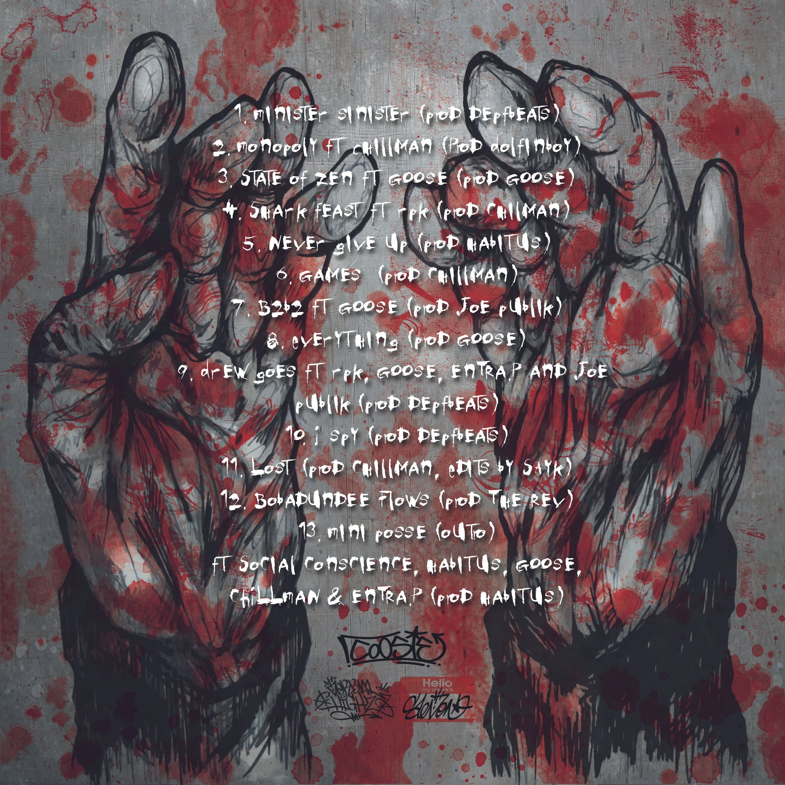
Back cover for Bobadundee. With the ravaged n bloody from murking MCs.
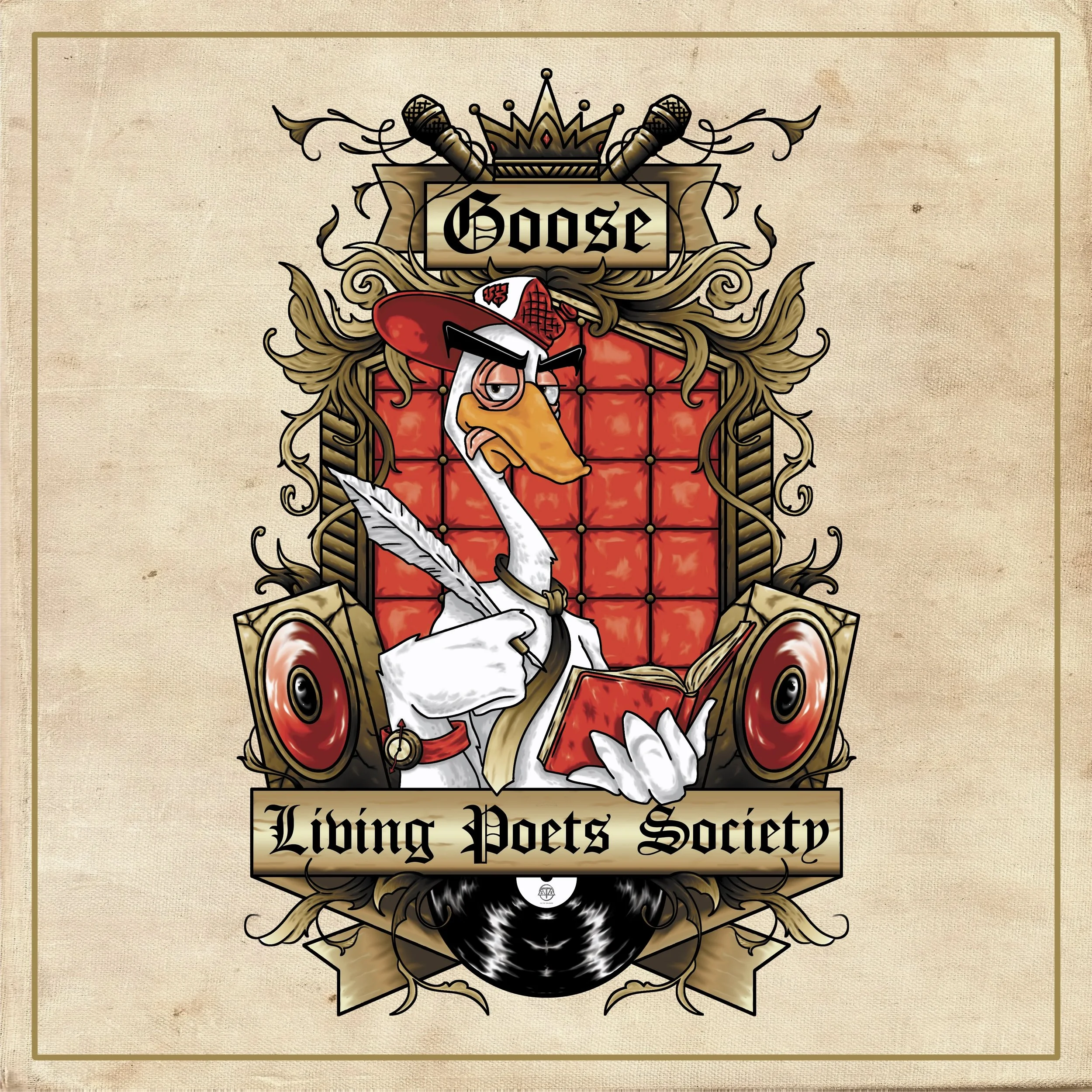
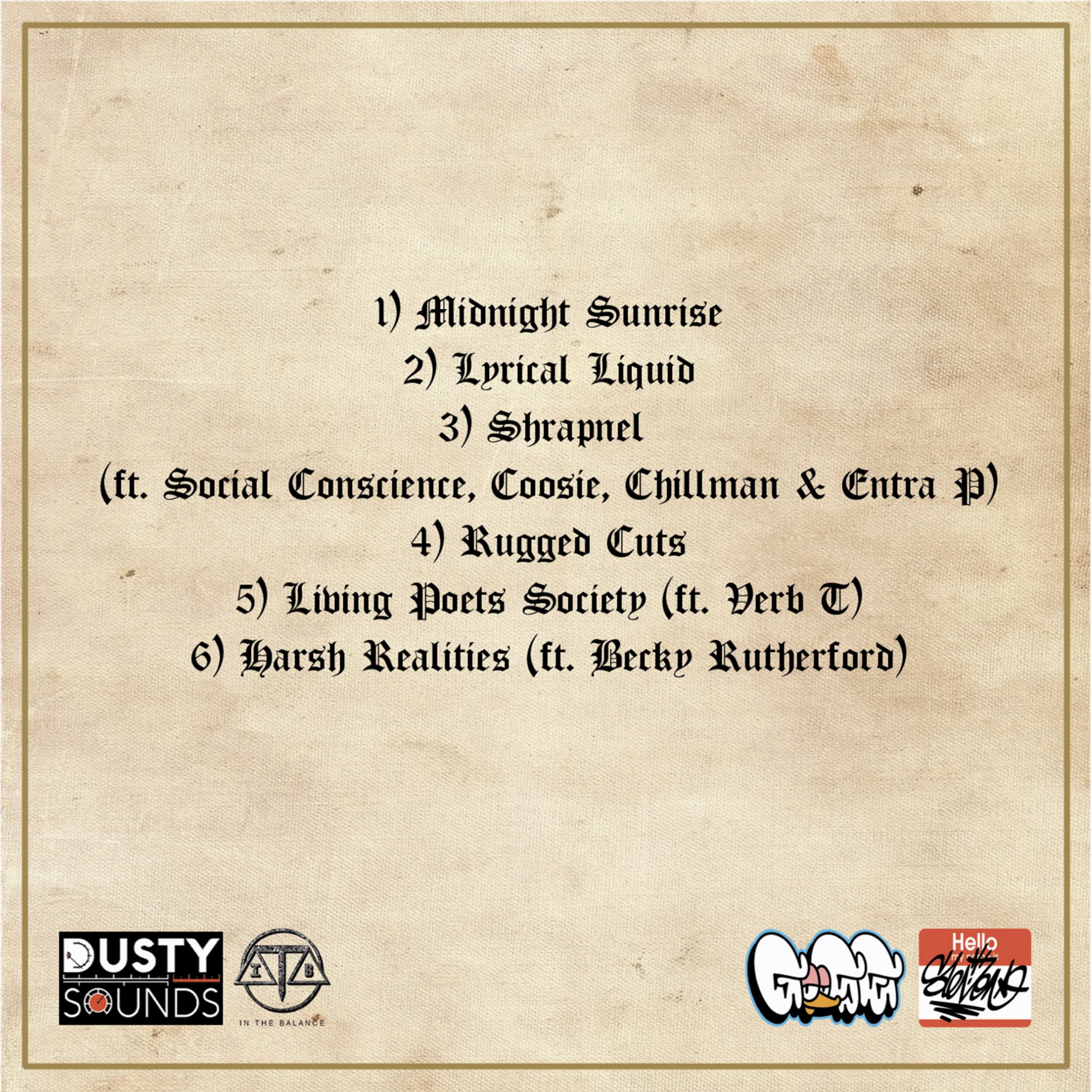
Cover art for Goose. Titled "Living Poets Society" His debut EP, released on In The Balance Records. Being the regular host for the monthly illustration battle & hip-hop night Scribble N Scratch that Sleven used to run, it was a delight for Sleven to see him finally put out his first full release. They worked closely on spit balling themes & ideas, back n forth. With Sleven coming to the conclusion that their should be an air of regal education to the piece, seeing as the EP title had the same name as the Robin Williams film. Which was set in a rather upper class private school. Adding the gold filigree, mics, speakers & crown, also a touch of red leather, turn the headmasters chair into a regal thrown of lyrical kingship. Using old english font on scrolls and with an aged textured paper background adds to the regal affect. Finishing the whole piece of with Goose as a studious looking Goose, keeping it hip-hop with his backwards cap but also regal by writing with in his red leather bound book with a quill.
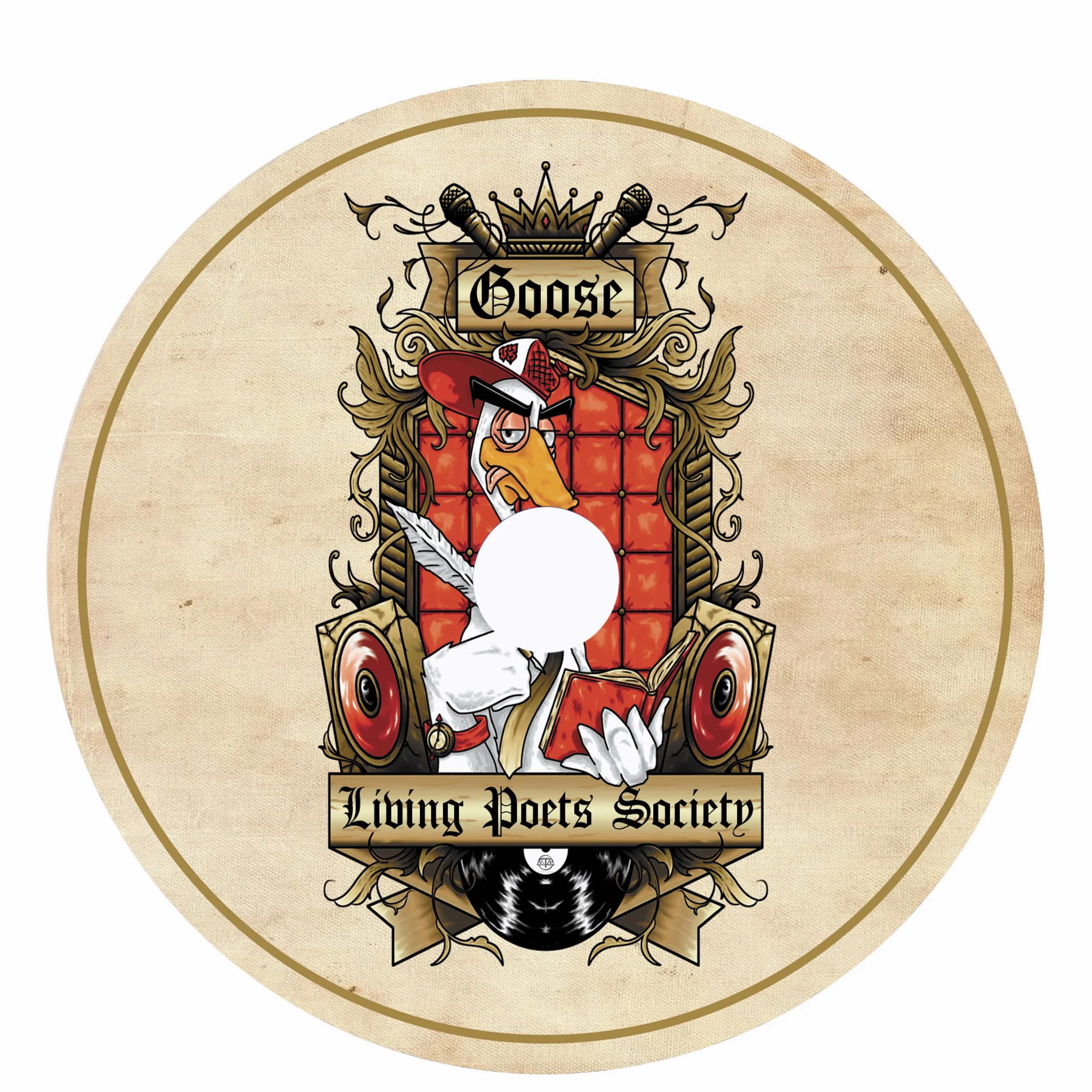
Living Poets Society cover jst reused for the cd art.
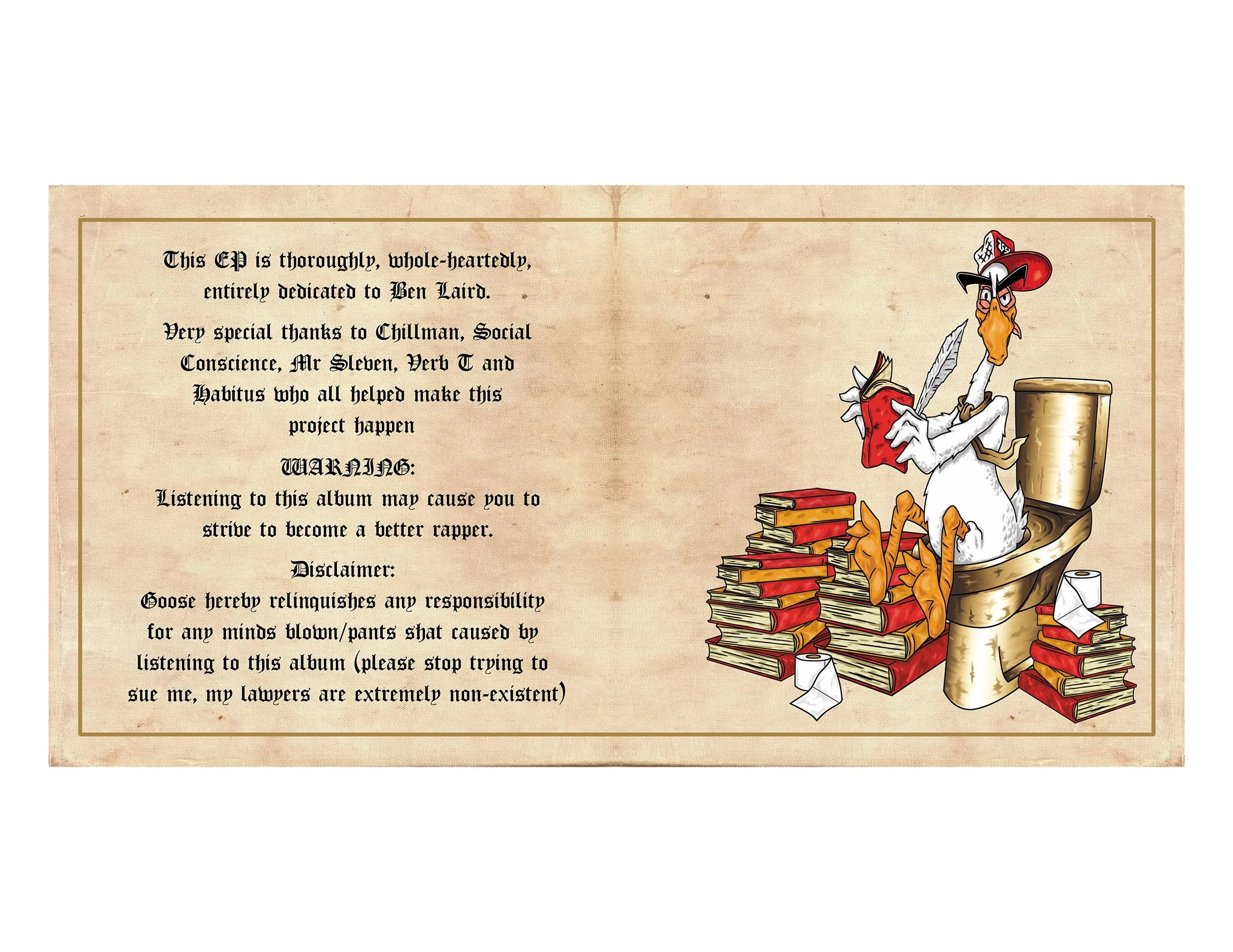
Inlay for Living Poets Society. On the left we have the shout outs from Goose. And on the right, we have Goose, surrounded by a stack of heavy rhyme pads, dropping a golden egg on a golden loo, whilst writing bars because all the shit he drops is straight up gold son!
Keeping it very simple on the back here but with old english font to stay in tone with regal educational vibe.
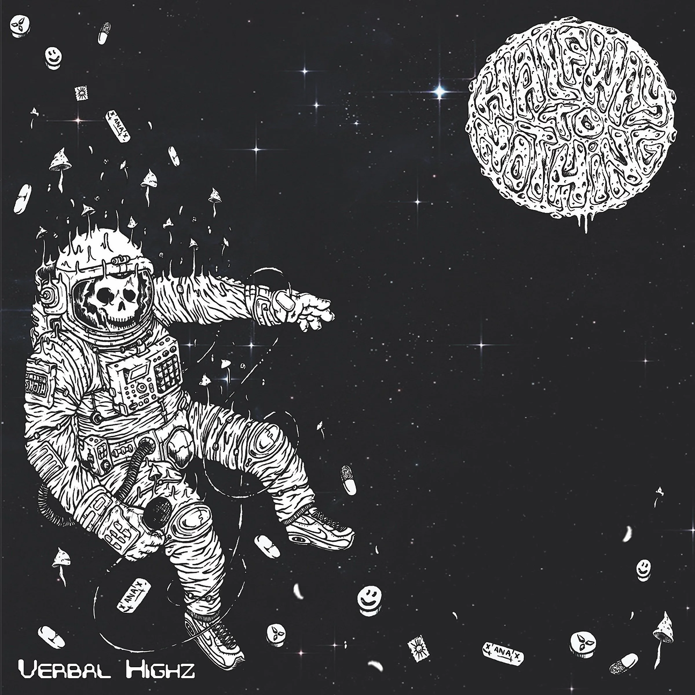
Cover art for Verbal Highz album, titled "Half Way To Nothing" Sleven was pretty much left to his own devices with interpreting the cover for this. After listening to the unfinished version of the album on repeat for a few days, he came up with this wavy image of a dead psychonaut MC drifting in space, clutching a mic in his hand. and an mpc strapped into his suit. Accompanied by all the mind altering narcotics he'd been consuming, from shrooms & xannyz to gurners & acid tabs. Placement of the title was illustrated into the moon in the top right. Choosing this was a play on how the moon is the closest visible object in the sky and anything past it just feels like you are half way to nowhere, half way to nothing. Both the moon and psychonaut also represent the levels of how verbally high these chaps are, high as the moon mudda fuggas!! The placement of the character & drugs is also in a wave formation, akin to the flow n sound of the album. Whilst there's a large gap of space between them and the moon, which is a representation of what being half way to nothing can feel like, a void of mass space! Finishing it all off with their name in an electronic sci-fi style font, in the the bottom left.
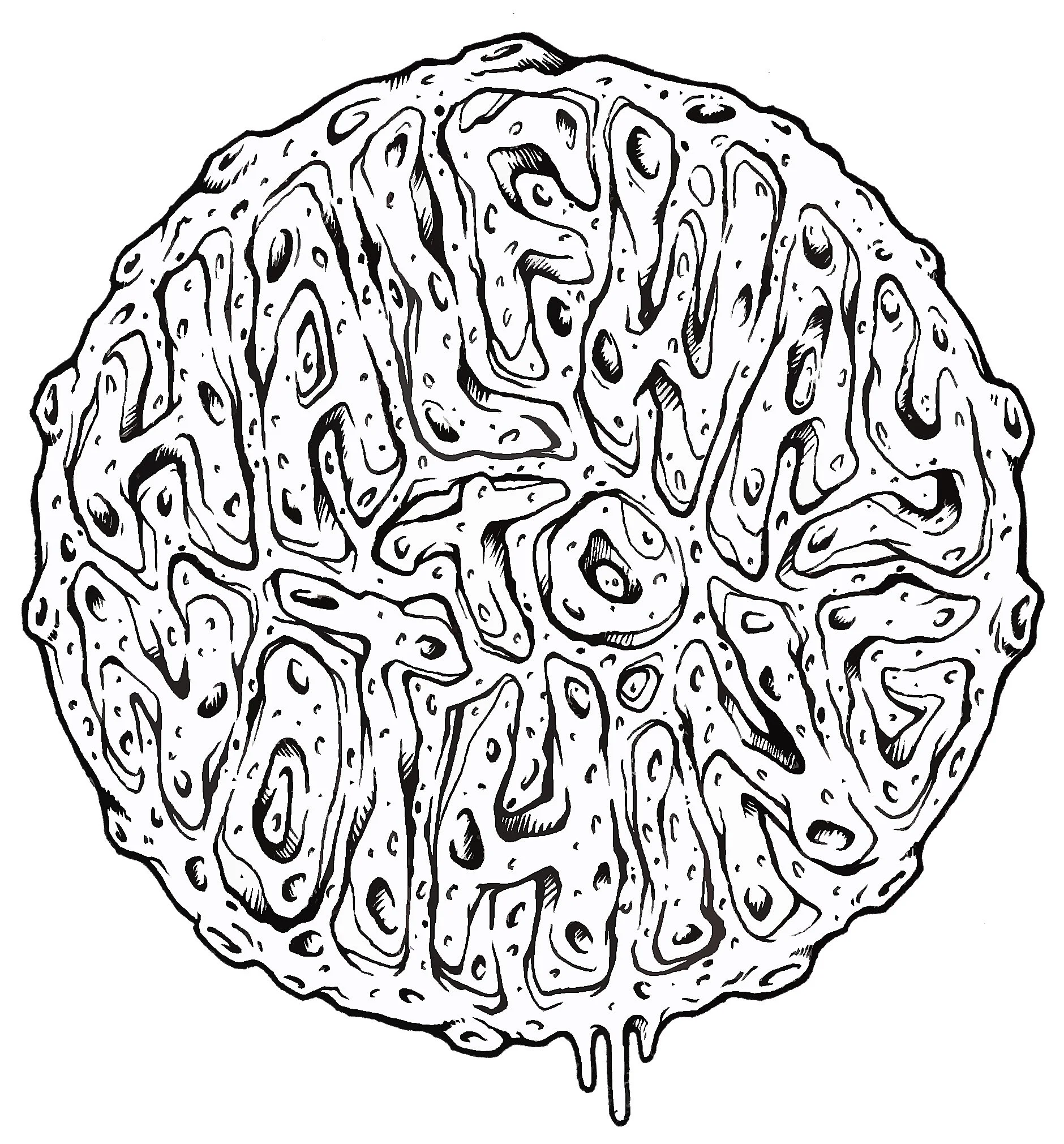
Utilising just the title of the album for the cd image as it worked perfectly for the fit.
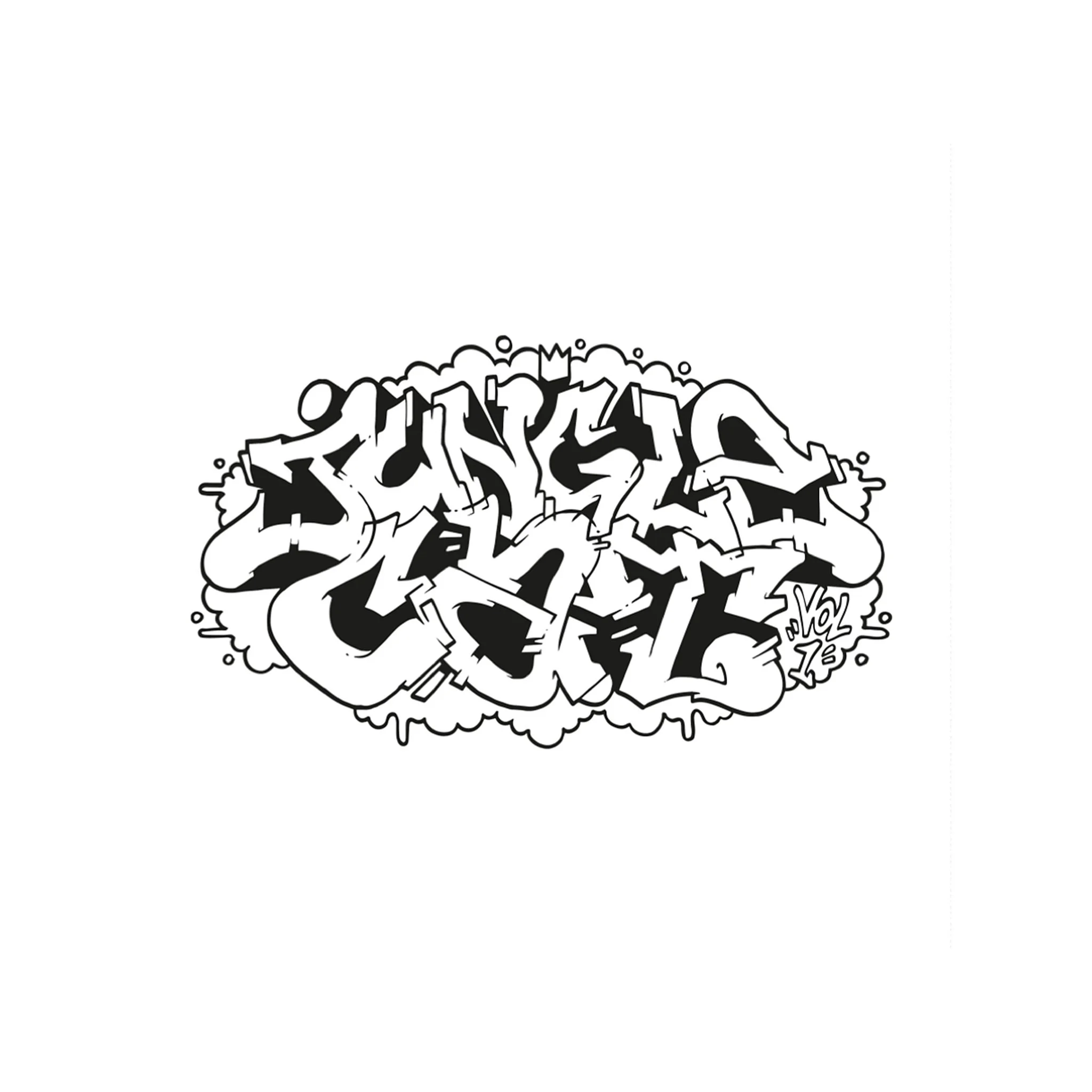
Cover art for Jungle Cat records with their first double vinyl record Jungle Cat Vol1. Nice and simple bit of graffiti lettering.
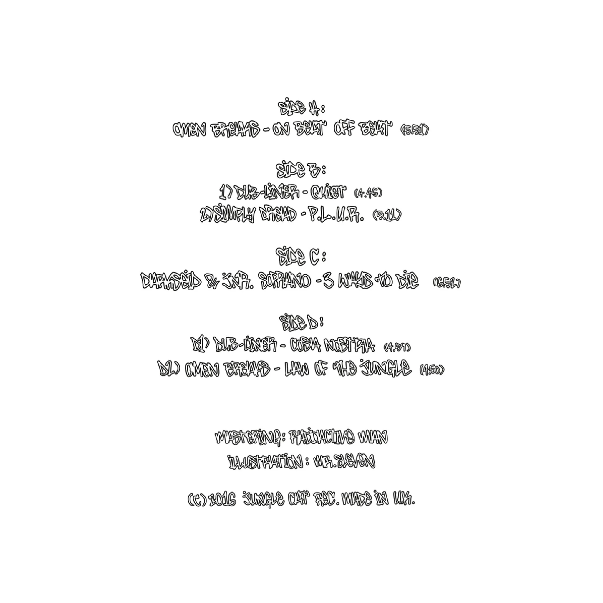
Back cover for the Jungle Cat Vol1 record
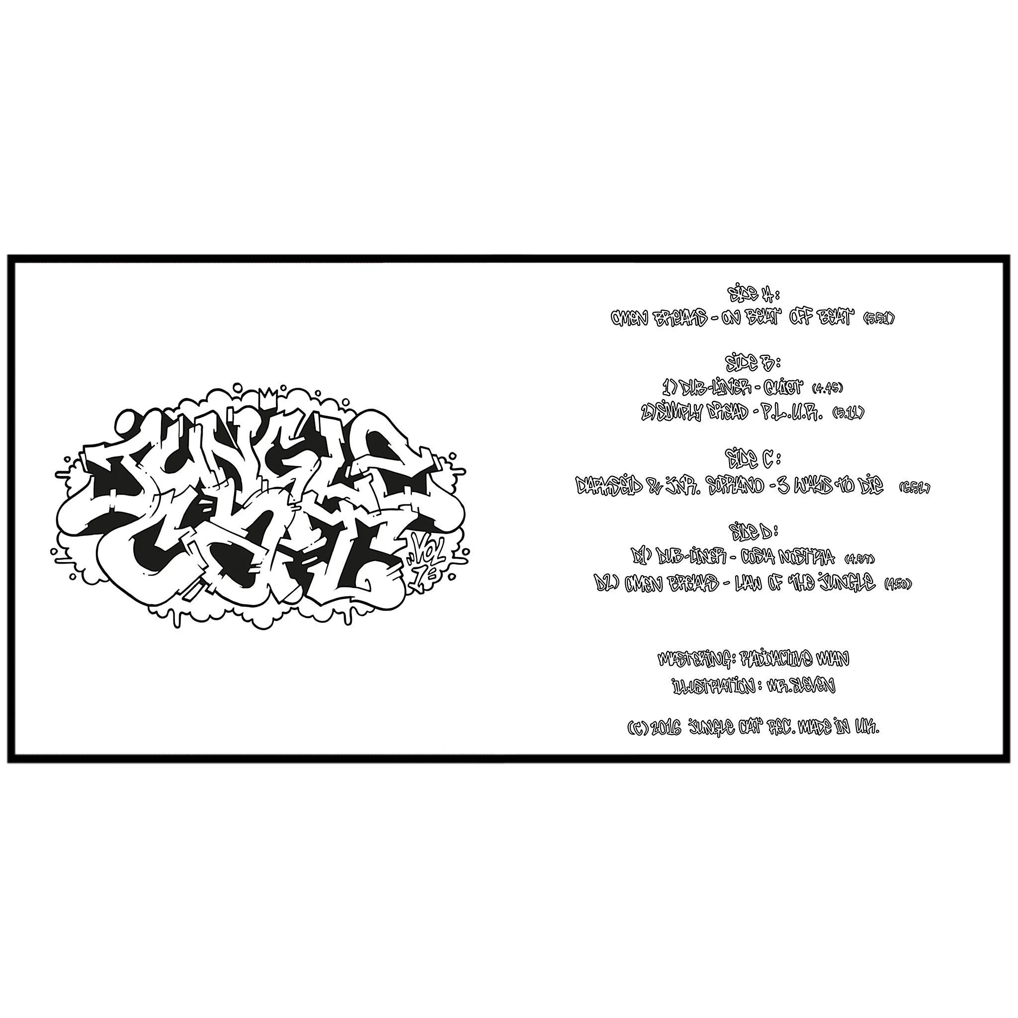
Front and back cover for Jungle Cat Vol1

Cover art for YEAH BUZZ & Audio Gutters EP. titled The Party Jouster EP. I believe this was from around 2013 and was one of Slevens first bits of cover art. Hand drawn, then lightly edited on photoshop.

Physical cover art for Habitus album "Beat The Pads, Write The Rhymes". Sleven's going to give you a bit of a back story to this one, as it was his the first album cover he ever created. At the time this was created, Sleven was running a monthly illustration battle and hip-hop night called Scribble N Scratch, around 2014/15. He'd not long come across Habitus, randomly through a chance encounter with a random MC at his local graff shop, whom recommended a youtube video of him and his house mates rapping at the top of a mound. From that he reached out to Habitus, met up with him at a gig and asked him if he'd be keen in getting involved with the Scribble N Scratch events. A short while after, Habitus is a monthly DJ for the SnS events and often gracing the MIC in the cyphers. A few months after he asked Sleven if he'd be keen on doing a little something for his album cover. Now Sleven's never created an album cover at this point but it's something he'd always wanted to do, since he first bought GZA's Liquid Swords album back in the late 90s, shit, possibly even before that, since he was in shock & awe of his mate showing himSnoop Doggs Doggy Style on the back of a bus, on a school trip at the age of 10, back in the mid 90s. Anyway, he was utterly gassed to do this and Habitus wasn't expecting much but Sleven went in on it, because he was achieving a life long dream. At the time, he wasn't proficient in digital art at all, so he went all in illustrating the pieces with acrylic paint, posca & pen, on large pieces of paper, that would measure to fit a CD cover when shrunk down digitally. The cover took a good few weeks to complete, possibly a month or two, because other commitments popping their head up and also the doubt demons poking away at Sleven, for aiming to achieve a life goal, which led him to scrapping numerous ideas. So, during this time, he'd a get a shout from Habitus, every week, asking if the cover was done yet. He could tell he was starting to lose a bit of patience but alas, this helped Sleven push through the doubt and commitments and blaze through the piece in no time at all. And he come up with this as his idea......An enlightened subterranean MC in his cave making hip-hop. The character has numerous arms which represent the numerous abilities Habitus possesses as a hip-hop artist, MC, DJ, beat maker, producer, scholar and pupil of the culture. The cave he's in represents the underground sound to the album and also its terminology for a studio. The third eye in the character, is the self awareness in the lyrical content, with him in a meditated state, floating above the speakers, which he's achieved though enlightening his soul through the process of making music. Once he had this down, the back and inlay pieces soon followed suite. When unveiling to Habitus, the man was in utter shock as he was only expecting something simple, with a quick turn around. He was fully gassed and appreciative with the outcome of art work though. Sleven had photos of all the art taken professionally through a friend, then with the help of Habitus, they laid down all the text digitally. In hindsight, there's many things now Sleven would of done differently, with planning out the piece and creating it but it was a massive creative step forward for him at that time, many moons ago!

One side of the inlay cover for Habitus album. This takes his logo, which is just tree represented in a simple set of five lines. Each line represents the pillars of hip-hop. With this, Slevens turned into an actual tree. The image is also an extension to a wider image of the front cover but set at sun rise.
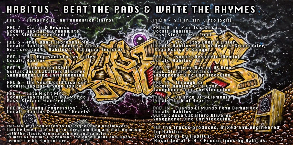
Inlay for the Beat The Pads Write The Rhymes album. This includes the full track list, features and shout outs on top of a garff burner that reads HABITUS. Sleven intentionally drew the piece to look like some kind of spaceship, with speakers attached to it coming down from space.

Back cover for the Habitus album . This was just an extension of the scene from the front cover, with a city scape in the night.